

November 5, 2025by Brenden Stefano
Shopify Migration for Commercial Ozone Generator Brand – New England Ecommerce Case Study
Case Study: Breathing New Life Into a Trusted Ecommerce Brand
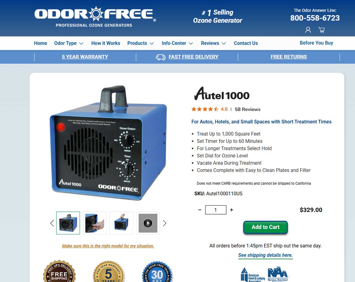
OdorFree is a well-established name in the commercial equipment space, known for high-quality ozone generators that eliminate odors at the source. Based in New England and shipping nationwide, the company serves businesses, institutions, and facilities that need powerful odor control solutions — fast and reliably.
For years, OdorFree ran on BigCommerce, but as the platform evolved, it became clear that it was no longer the right fit. Mike and Spence, the duo behind the business, found the built-in tools increasingly clunky and limiting. They needed a platform that matched their workflow, gave them flexibility without frustration, and would grow with them.
They came to us with a clear goal: move their successful ecommerce operation to Shopify — and make the transition seamless.
A Strategic Platform Migration
First and foremost, we handled the full migration from BigCommerce to Shopify with care. OdorFree had an established presence, steady traffic, and strong SEO value — none of which could be compromised. We followed our in-house SEO migration checklist to the letter, ensuring all critical redirects, metadata, and URL structures were properly mapped and preserved.
Project Name
Shopify Migration for Commercial Ozone Generator Brand – New England Ecommerce Case Study
Client
Mike and Spence, OdorFree
Our Role
Shopify migration and Shogun rebuild | SEO Audit and Basic SEO Strategy
Location
HQ in New England, ships nationwide
Industry
Commercial Equipment / Odor Removal / Online Sales
Author
A Familiar Design, Modernized
Mike had a strong attachment to the existing look and layout of the site, and rightfully so — it worked. Instead of forcing a total redesign, we used Shogun to rebuild the site in a way that matched the original style, but with a cleaner, more polished execution. This approach honored what made the old site successful, while leveling up the usability and visual cohesion across devices.
Built on Tools That Work for Them
One of the key reasons Shopify was the right move? Shogun. Mike felt comfortable using it, which meant he could make updates and manage pages without depending on a developer for every small tweak. Our job was to set up a system they could actually use — not just something that looked good in a handoff document.
SEO and Analytics: Setting the Foundation
Post-launch, we’ve continued supporting OdorFree with ongoing SEO improvements, as well as building out data analytics tracking to give clearer visibility into site performance. As we deepen the relationship, we’re focused on growth: bringing in more traffic, improving conversions, and helping OdorFree stay competitive in a niche market.
Results
✅ Zero SEO Drop-Off
Our careful migration process meant organic traffic remained steady through the platform switch — a rare feat with ecommerce migrations.
✅ Simplified Content Management
With Shogun in place, the OdorFree team can now update pages quickly and confidently.
✅ Improved Site Polish
Same structure, but smoother — with better spacing, typography, and flow throughout the site.
✅ Ongoing Partnership
We continue to support OdorFree with SEO strategy, analytics, and optimizations as their business evolves.

November 5, 2025by Brenden Stefano
National Custom .net Immigration Bond Portal
Case Study: Custom Portal Development for Immigration Bond Services in Fort Lauderdale
How US Immigration Bonds Upgraded from a Risky Desktop App to a Secure, Scalable, Multi-User Platform
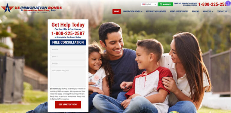
US Immigration Bonds (USIB) is a national leader in helping families post immigration bonds — fast. Based in Fort Lauderdale, Florida, their team has guided thousands through the often stressful process of securing release for loved ones. The mission is simple but urgent: get people out the same day, safely and legally.
But behind the scenes, their tech was overdue for a serious upgrade.
Before the rebuild, USIB was working with a legacy desktop system that had served its purpose for years. But as their operations grew and evolved, that setup began to show its limitations — especially when it came to scalability, flexibility, and modern security standards. The system wasn’t built for the dynamic, multi-touch workflows USIB handles daily with applicants, courts, and families. It was time for a platform that could move at their pace — secure, seamless, and future-ready.
Project Name
National Custom .net Immigration Bond Portal
Client
Margy & Richard - US Immigration Bonds (USIB)
Our Role
Custom .NET Portal Development (on nopCommerce base)
Location
National (HQ in Fort Lauderdale, FL)
Author
What We Did: A Custom Portal Built on .NET (with a Twist)
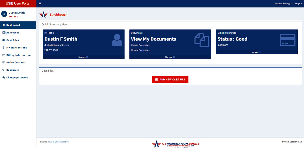
USIB already had a solid WordPress marketing site in place, so our focus was the operational engine behind it. We designed and developed a fully custom .NET platform, built on nopCommerce — yes, an e-commerce framework, zhushed up to serve a completely different need.
The new portal supports three key user types:
- Admin (USIB team handling cases and payments)
- Applicants (the person needing the bond)
- Family or Friends (supporters who want to help)
Here’s how we turned a troublesome process into a sleek, secure workflow:
Role-Based Dashboards
Each user sees what matters to them — and nothing else. Admins manage bonds and payment status. Applicants can upload documents, track progress, and see upcoming actions. Family members can securely contribute funds or documents to support the case.
Smarter, Safer Payment Workflows
We built a secure, compliant payment architecture using Authorize.net — designed to authorize credit card amounts without triggering charges unless certain legal conditions are met. No card data is ever stored, and we layered in intelligent gateway logic that routes transactions based on BIN numbers, bank types, and timing. The result? A future-proof payment system that minimizes fraud risk and keeps operations protected.
Automations & Schedules
Applicants and their supporters get automated reminders to update cards, complete documents, or take next steps. Scheduled tasks keep the system humming — no manual chasing needed.
Smart Legal Document Handling
We built a form builder that auto-populates complex legal documents — like mortgages or deeds — directly from account data. It saves time, cuts errors, and simplifies the legalese.
Multi-User Support
Families can now band together to post collateral. Our system makes it easy to split responsibilities, invite others, and securely contribute via credit card or documentation.
Results: Compliance, Confidence & Scalability
The transformation speaks for itself. USIB went from an outdated, risky desktop app to a modern web portal that’s scalable, secure, and built around their unique workflow. The system is in daily use, with zero downtime and full client control.
Margy, the driving force behind USIB, has been thrilled with the outcome — so much so that she’s already planning the next phase: expanding the platform into a full-service help center, integrating AI and exploring crypto-based collateral options.
And we’re here for it.

November 3, 2025by Brenden Stefano
Medical Imaging Website Design for Mansa Medical | WordPress + CRM Integration
Case Study: Elevating a Pioneer in Mobile MRI Solutions
Mansa Medical provides turnkey MRI and CT solutions, with a strong focus on mobile imaging units. Their work supports hospitals, clinics, and providers across the country, helping them deliver diagnostic services without the delays or cost of permanent infrastructure.
Their team needed a website that could clearly communicate what they offer, show how the mobile systems work, and support an organized sales process. The previous site didn’t reflect their growth or the technical standards they’re known for.
Zulu Shack Creative was brought in to consult, design and build a new site that feels trustworthy, easy to navigate, and built for scale.
The goal was simple: make it easier for Mansa’s customers to understand what they do and how to get started.
Project Name
Medical Imaging Website Design for Mansa Medical | WordPress + CRM Integration
Client
Freddy - Mansa Medical
Our Role
Web Design, CRM Integration, Illustration, Form Automation, SEO Strategy
Location
Colorado
Industry
Medical
Author
What We Did: Custom WordPress Build with Smart, Sales-Ready Integrations
Zulu Shack Creative’s goal was to create a web experience that mirrored the company’s approach — streamlined, professional, and built to serve. While technically based on a premium theme, the final product is essentially a custom WordPress site, refined through multiple design iterations and strategy sessions.
Here’s how we brought it to life:
- Tailored Theme Customization: We took a theme, stripped it down, and rebuilt it with custom components to reflect Mansa Medical’s brand authority and technical edge. The result? A clean, modern design that feels entirely unique — without the custom price tag.
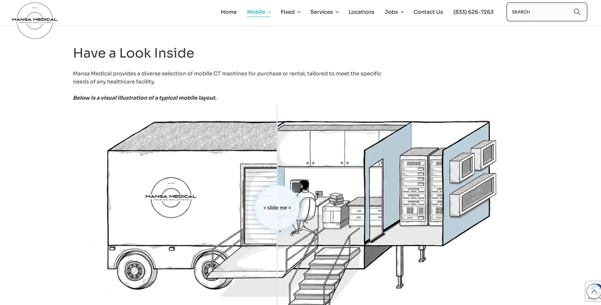
- Illustration Meets Interaction: To help visitors understand the mobile imaging units, we brought in Chanelle, our in-house illustrator, to create detailed diagrams of the trailers and equipment. We integrated her artwork into before-and-after sliders and interactive elements, giving potential customers a real-world sense of how these solutions work.
- Sales-Driven Form Integration: Brenden Stefano led the charge on integrating WPForms Elite with Microsoft Sales CRM. This means every lead that comes through the site is instantly routed to the right internal team — essential for a fast-scaling business like Mansa Medical.
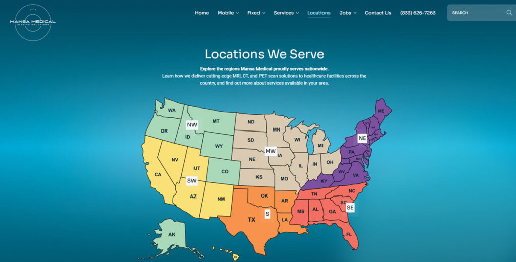
- Interactive Map for Service Coverage: We built an interactive service map that not only looks great but is also SEO-savvy. Each main location cleverly expands into sub-locations, increasing search visibility and helping users find the services nearest them.
- Consultation + Execution: From strategy to delivery, our team was hands-on. We stayed flexible and responsive throughout the project, making sure Freddy and the team had exactly what they needed — no shortcuts, no compromises.
Results: A Site That’s as Reliable as Mansa Equipment
The new Mansa Medical site delivers across the board:
✅ Clean, modern design that reflects their professionalism
✅ Custom visual tools to showcase mobile MRI/CT units
✅ CRM-integrated lead system for smoother sales workflows
✅ SEO-friendly location breakdowns
✅ Ongoing maintenance so their team can focus on what matters
The new site gives their team what they needed: clear messaging, reliable integrations, and less time spent chasing down leads or managing backend systems.

November 3, 2025by Brenden Stefano
WordPress Website Redesign for Bookkeeping Consultants | Office Accomplice
Case Study: A Fresh Start for a Unique Bookkeeping Brand
Amy and Mallory, the dynamic duo behind Office Accomplice, aren’t your average bookkeeping consultants. Their brand champions flexibility and personality — helping small businesses manage their books without forcing them into cookie-cutter systems.
But while their message was clear, their old website… wasn’t.
They were dealing with slow load times, outdated forms, and a site that just didn’t reflect their tone or services. Even worse? Leads were disappearing into the void — they had no clue where inquiries were going, or if they were even being delivered.
It was time for a clean slate — one that matched the clarity they bring to their clients’ finances.
Project Name
WordPress Website Redesign for Bookkeeping Consultants | Office Accomplice
Client
Amy & Mallory - Office Accomplice
Our Role
Custom Themed WordPress Design, WordPress Development, Lead Configuration and Integration
Location
Washington DC
Industry
Accounting
Author

What We Did: Clean, Fast, and Friendly (Just Like Their Services)
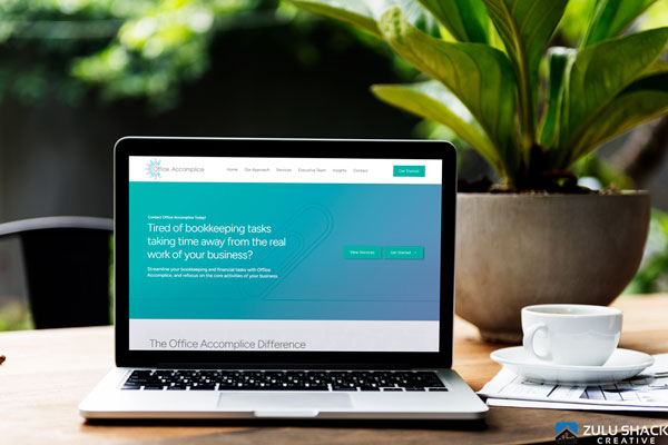
Zulu Shack Creative approached this redesign with a clear mission: build a website that’s fast, simple, and aligned with the brand’s personality — without the price tag of a fully custom build.
Here’s how we did it:
- Smart WordPress Build: We used a premium theme as a starting point, then layered in customizations to match Office Accomplice’s brand. This gave them the feel of a fully custom site at a fraction of the cost — a sweet spot we often hit for service-based businesses.
- Streamlined UX: We simplified the layout and content to guide users through their offerings and values, while keeping everything readable and approachable.
- Form Fix-Up with WPForms Elite: The old contact system wasn’t just outdated — it was broken. We implemented WPForms Elite to create user-friendly, trackable forms, ensuring inquiries never go missing again.
- One-on-One WordPress Training: We didn’t just build the site and walk away. Amy received a full Loom training library and dedicated one-on-one support to help her feel confident managing content, forms, and leads. All within the original budget.
- Managed Hosting & Maintenance: Office Accomplice now runs on our basic hosting package, which includes regular plugin updates and health checks. Their website is secure, stable, and smooth-sailing.
Results: A Confident Client with a Site That Works
Since launch, Office Accomplice has a website that’s:
✅ Fast-loading
✅ Clear and on-brand
✅ Easy to manage internally
✅ Capturing leads effectively
✅ Hosted and maintained hassle-free
Most importantly, Amy now feels confident and in control of her digital presence — knowing her site reflects her business and works just as hard as she does.

October 30, 2025by Brenden Stefano
Custom .NET Gamified Platform for Poker League | South Florida
Case Study: How the Octalysis Framework Transformed a South Florida Poker League with Zulu Shack Creative
A Quietly Radical Poker Project
Rock N Roll Poker League was never trying to be a tech company. At its core, it’s a grassroots, free-to-play poker league that takes place across local bars in South Florida. Founded by Billi and Pat — a couple who love the game and the people it brings together — the league is as much about community as competition.
For some time now, it ran on word of mouth, regulars, and a basic WordPress website that posted times and venues. It worked — as much as it could.
The digital experience couldn’t keep up with the momentum offline. There was no easy way to track performance. No player history. No way to make the game feel like more than just the night’s results. The league had grown — the tech hadn’t.
Brenden, founder of Zulu Shack Creative and a longtime poker player himself, saw the disconnect. More than that, he saw the opportunity: to design a system that didn’t just display information, but deepened the player experience.
So he pitched something bigger — and backed it personally.
Project Name
Custom .NET Gamified Platform for Poker League | South Florida
Client
Billi & Pat - Rock N Roll Poker League
Our Role
Custom .NET Development, Gamification Strategy, UX Design, Data Architecture, Investment Partner
Location
South Florida
Industry
Entertainment / Gaming
Author
Building for Motivation
Zulu Shack Creative rebuilt the platform from scratch, using custom .NET development to handle live data, seasonal resets, and real-time player engagement.
The foundation of the rebuild was the Octalysis Framework — a gamification model that taps into human motivation through eight psychological drivers.
Four of them became central to the new platform:
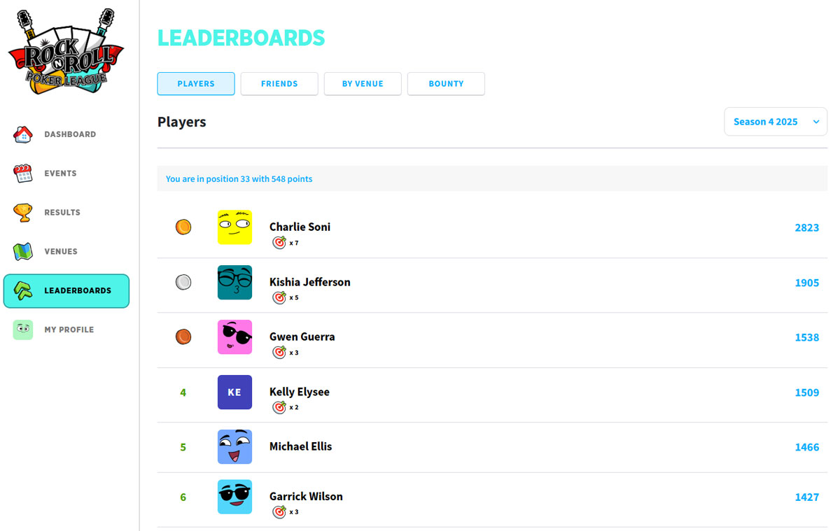
- Development & Accomplishment: Players now earn XP, Chip-Ups, and seasonal ranks for participating and placing — turning each game into part of a longer-term journey.
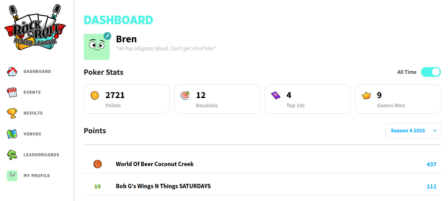
- Ownership & Possession: Personal profiles, avatars, and performance stats help players track progress and take pride in their history.
- Social Influence & Relatedness: Leaderboards, venue rivalries, and dealer shout-outs create moments of recognition and friendly tension.
- Unpredictability & Curiosity: Dynamic rewards and evolving achievements make the experience feel less like a scoreboard, more like a story.
The result is a platform that feels alive — where every attendance, win, or loss contributes to a growing narrative.
The First Results Are In
Within just weeks of launching the new platform, the league saw a 50% increase in player turnout for games and tournaments.
That kind of lift doesn’t come from promotion alone — it comes from deeper engagement. Players don’t just show up; they participate with purpose. They check their stats, compare with friends, and come back to move forward.
It’s poker, reimagined not as a one-off event, but as an evolving experience.
A Long Game, Played Right
This rebuild is only phase one. The system is already built to support future layers — mobile apps, badge systems, deeper XP economies, and more advanced gamification mechanics. But what makes this project different isn’t the tech stack. It’s the partnership behind it.
This isn’t a client-agency relationship. It’s a shared bet.
Brenden didn’t just design the system — he became a stakeholder in the league itself, committed to building something meaningful with Billi and Pat for the long haul.
The goal? See how far they can take it. National scale, maybe. Maybe more. But the point isn’t pressure — it’s momentum.
In poker, as in life, the chips fall where they may. But with the right table, the right partners, and the right strategy — you play the hand all the way through.

October 29, 2025by Brenden Stefano
Nonprofit Website Design in Miami: A Bold, Fast Platform for Eyes on Your Mission
Case Study: A Visionary at the Intersection of Media and Social Change
How a purpose-driven digital experience supports youth empowerment, video storytelling, and global impact
Jessica Kizorek is a dynamic force in the world of nonprofit media. As the founder of Eyes on Your Mission, a Miami-based 501(c)(3), she leads an organization that empowers underserved youth through video production, STEAM-focused learning, and real-world creative experiences. With a global reach and local roots, Eyes on Your Mission equips students with tools for storytelling, entrepreneurship, and professional growth — all while supporting nonprofits through powerful, purpose-driven media.
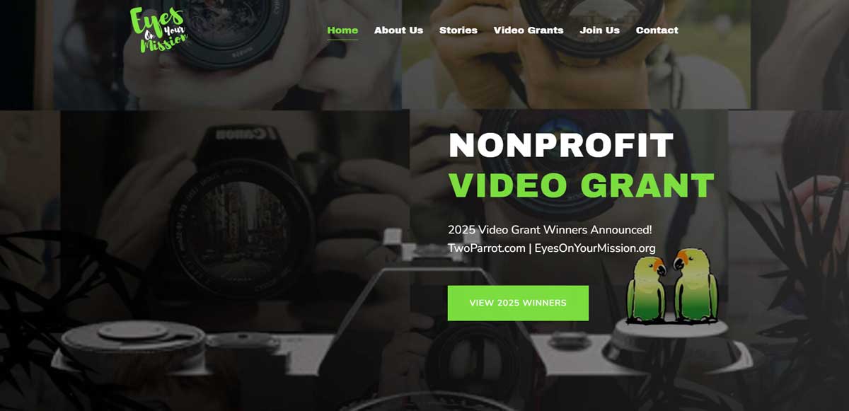
When Jessica approached Zulu Shack Creative, her vision was compelling: she needed a website that could serve as the digital nerve center for her growing ecosystem of programs, partners, and youth initiatives. It had to be fast, beautifully designed, and able to communicate her mission at a glance — while also functioning as a practical tool for students, educators, and funders alike.
Project Name
Nonprofit Website Design in Miami: A Bold, Fast Platform for Eyes on Your Mission
Client
Dr. Jessica Kizorek
Our Role
Brand Consulting, Custom WordPress Site, Integrations
Author
Challenge: Building a Site as Bold and Agile as the Brand Itself
Jessica’s mission was crystal clear — but her existing web presence didn’t reflect the energy, sophistication, or scope of her work. She needed a platform that could do it all:
- Highlight grant opportunities and film projects
- Showcase her educational programs
- Attract funders and partners
- Engage students through clear, intuitive design
As a social impact leader working across media, education, and nonprofit sectors, the website had to balance creative storytelling with high-performance functionality — and scale with her growing initiatives.
Our Approach: Fast, Flexible, Future-Ready
Zulu Shack Creative took a strategy-first approach to the redesign, focusing on user experience, content flow, and speed optimization. The new site needed to reflect Jessica’s distinctive brand identity while staying accessible to a wide audience — from tech-savvy funders to students navigating from a smartphone.
Key Features Delivered:
- Custom UX/UI Design: Streamlined, expressive layouts tailored for media-rich content and storytelling
- Video-Optimized Framework: Built to showcase film projects without compromising site speed
- Audience-Specific Navigation: Clear pathways for students, partners, educators, and funders
- Performance Engineering: Page speeds scoring in the high 90s, ensuring fast load times across devices
- Scalable CMS Integration: Designed for easy updates and future program expansions
The end result? A clean, modern site that feels both inspiring and intentional — with the speed and flexibility to grow alongside Jessica’s vision.
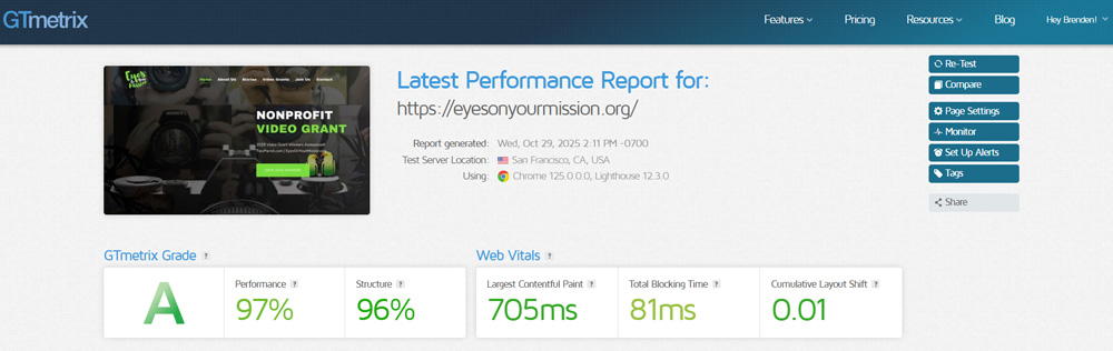
Results: Performance, Praise, and a happy Dr Jessica Kizorek!
While formal metrics are still being gathered, early feedback has been overwhelmingly positive:
- High 90s performance scores for site speed and optimization
- Consistent praise from industry peers on design and usability
- And most notably: Jessica herself was over the moon and in her words she has found her guys for her website needs.
The impact of a well-executed digital platform can’t be overstated — especially for a nonprofit serving at-risk youth and advocating for creative equity. This project wasn’t just about a website; it was about creating digital infrastructure for real-world change.
Looking Ahead: A Continued Partnership
Following the success of the Eyes on Your Mission website, Jessica tapped Zulu Shack Creative to redesign her other venture, Two Parrot — a media production company focused on storytelling for social good. That project will be featured in an upcoming case study.
At Zulu Shack Creative, we specialize in crafting websites that do more than look good — they work for the people they’re built to serve. The Eyes on Your Mission project exemplifies our belief that strategic design and technical excellence can amplify voices, empower communities, and support missions that matter.

March 8, 2024by Brenden Stefano
250 More Monthly Cases for Steinger, Greene, & Feiner

We helped Steinger, Greene & Feiner increase organic sourced signed cases from 256 to 527 per month (+110%) in 1 year through our high converting SEO system.

Ladies and gentlemen of the jury! In this case study, we are discussing a personal injury law firm that came to Zulu Shack Creative in 2019. They asked us to increase search engine ranking, traffic, and leads– and as the lord is our witness, we delivered. No, we exceeded expectations and established a commanding online presence for them.
As this is an SEO case study for a personal injury law firm, we have had to keep some of the details private; however, we have shared as much as we can to prove how important SEO for a personal injury law firm is.
Results
We can see organic results here, laid out with a timeline of the fixes that were made to the website. This is the part of the SEO case study that you have all been waiting for, let’s dig into the results.

- Work Began With the Client!
- Discovery
- Transitioned from the previous SEO agency.
- All the strategies were created.
- Link building began.
- Content creation, consolidation, and optimization began.
- Making Fixes!
- All 404 errors were redirected.
- All 301 redirect chains were unraveled and redirected.
- Backlinks were disavowed.
- Schema was updated and added to the website.

- The New Website Was Launched
- All content was optimized.
- Metadata was updated.
- Website speed issues were resolved.
- New locations were added to the website.
- Viral Content
- A few of our published articles hit viral status by February.
- We were continually pumping out new content at a rate of about 10 pieces per month.
- This content has since tripled the website’s traffic and doubled conversions
- Efforts Were Paying Off!
- The link-building strategies had paid off and we were seeing a major increase in rankings to case-type pages.
- All the crawlability fixes had worked! More pages were indexed and more content was ranking well.
Organic Traffic
There was an 82.76% increase in non-branded, organic traffic 14 months after the contract began, jumping from 7,655 to 34,440 monthly visitors. We focused on non-branded traffic because the firm had down traditional marketing for decades and had a well-established name. So by all accounts, most branded searches were likely started by billboards, television commercials, taxi banners.

Organic Metrics According to aHrefs

Keywords According to SEMrush
We focused on more longtail keywords and top-of-funnel queries. The idea was to find potential personal injury clients when they are at the beginning of their journey, looking for answers related to finding a lawyer.

But we didn’t limit our content there. We also focused on content that would reach clients after they had hired a lawyer or even after they received a settlement. The idea was to become an authority in the personal injury law niche, which means that our content should serve everyone, even nonclients. That would raise our ranking on search engines and place us in a better position to convert more potential personal injury clients.
Leads & Cases
And finally, the only metric that really matters: did our client receive more leads and open more cases?
YES!
We cannot put in data from Call Tracking Metrics or Salesforce for privacy reasons. We would love to display it for all to see how great the Zulu Shack Creative SEO team really is and to make this SEO case study of a law firm complete, but alas, this is one bit of data we have to keep private.
What we can say is:
- Calls from organic sources increased by 110% on average by the 14-month mark.
- Case signups also increased by 87% on average by the 14-month mark.
The increase in traffic directly correlated with an increase in leads and sales. Phones were ringing, traffic was coming to the website, and all was right with the world of personal injury law.
Law Firm SEO Case Study Conclusion
With a bit of elbow grease and a lot of discipline, the Zulu Shack Creative team set out to completely transform this law firm’s website into something incredible while ensuring that the phones kept ringing off the hook with calls from new clients.
We transitioned from another SEO agency, audited the website, created our plan, and worked for months to watch it build and grow into a massive success. This case study is just one of the many examples of the successes and growth that Zulu Shack Creative has delivered to clients for over 10 years.
The only question is, are you ready to take your business up a notch?
The Who
Not the band, the client. Whom is this SEO case study all about? Well, we must keep all names confidential. We can tell you that this particular client was a multilocation, personal injury law firm with more than 200 employees.
This personal injury law firm was founded in the early 90s. They had previously established themselves through long-standing traditional marketing efforts (i.e. billboards, television commercials, taxi banner ads).
Then they made the choice to get more aggressive online. SEO marketing hadn’t achieved the desired results yet. While a PPC firm created many fantastic ads that were successful, the SEO efforts from their previous SEO company had been lackluster. They requested our SEO and personal injury digital marketing services towards the end of 2019.
This case study covers the initial growth period from 2019 to 2021.
Project Name
Classified*
Our Role
SEO and Strategy
First 90 days
We increased cases gained from organic traffic by 25% per month in the first 90 days.
Non Branded Traffic
Zulu Shack Creative increased non-branded traffic by 349.9% in 14 months, jumping from 7,655 to 34,440 monthly visitors.
Backlinks
Thier backlins increased by 249.1%, from 8,498 to 29,671.
More & More Cases
110% increase after 14 months!
Keywords
And ranking keywords increase by 95%, from 9,219 to 17,982
Author
Ryan Kemp
Getting Started
Here at Zulu Shack Creative, we believe in 3 things:
- Alex Ferguson was the greatest football manager of all time (that would be soccer to our American families).
- Discovery is a VITAL part of the process. We want to know everything there is to know about our client so we can make an outstanding marketing strategy.
- Our client’s success is our success; our client’s failure is our failure. We celebrate wins with you and we are up late at night fixing issues when they arise. You can call us old-fashioned, but we guarantee you will never call us uninvolved.
With that in mind, we arrived at the discovery section of our SEO onboarding process. The “meet, greet, give us the deets” part of our marketing strategy. During our discovery meetings, we learned a lot about this client.

The Brief
Previous SEO Agency: The law firm was working with another SEO agency that they believed was not delivering. They received reports from the previous SEO agency, but not much work–few deliverables and no changes made to the website in some time.
Brand Name Change: The company changed brand names in 2018, which caused a major drop in organic traffic. The website had also experienced a notable drop in all calls from organic sources.
Other Marketing Efforts: They relied on PPC and traditional advertising to a large degree. The firm’s marketing department believed that there was a large organic market that they should be tapping into more aggressively.
The firm’s internal marketing department had monitored organic success through Google Analytics, reports from the previous SEO agency, and through their call center, where potential clients would answer “how did you hear about us” questions.
The Goal
If you don’t know where you’re going, how do you know when you get there? That should be the motto of all good SEO strategies and case studies!
There’s something magical about working with a client that has so much SEO potential but has not harnessed it yet. And this law firm had lots of SEO potential. It’s like kinetic energy, just waiting to be realized onto the internet to reach potential clients.
Our goals broke down as follows:
- Transition: The client asked us to smoothly transition away from their current SEO firm, one that was charging far too much and delivering far too little, and to take the lead on all SEO efforts in the future.
- Increase Leads: Additionally, the goal was to increase organic leads as much as possible, by whichever means we thought were necessary.
- Increase Traffic: The brand name change had caused some major traffic downturns; the law firm wanted to correct this and return to previous traffic levels, or ideally, exceed those levels.
- Open More Locations: Expansion was in the air! The firm was planning a robust expansion effort that included opening up another 5 to 10 locations in states across the US.
- Transparency: Finally, the client wanted transparency. What were we doing, exactly, and how was it helping? Those lawyers love details so this was a match made in heaven. Zulu Shack Creative is a BIG believer in full transparency and details. We don’t hide the secret sauce; we tell all our clients exactly what we do.
Now the fun can begin! The Zulu Shack impis got to work gathering resources and scouting the battlefield to begin transforming this personal injury law firm into a massive online success.
The Plan
A well-laid-out SEO strategy is a good SEO strategy. And the same applies to a detailed SEO case study. So here are the deets.
With our discovery out of the way, the brief in our hands, and the goals clearly assessed, we got to work creating a plan that we could implement to reach success.

Phase 1: Transition from the previous SEO agency in a smooth, thorough, and chivalrous fashion.
We spoke with the previous agency for a few weeks and gathered all the information we needed to move into the next phase.
During this phase, it’s important to enter each meeting with a complete list of all the most vial SEO-related information. Once the previous SEO agency departed, it would be difficult, if not impossible, to get some of this information again.
We collected everything we needed to take over including benchmarks, past reports, strategies regarding the brand name change, and the strategies they planned to implement. We covered all bases. We wanted to see what had been done and what they thought should be done next. It’s always a good idea to get information from people so close to the project. Even if we decided not to use their strategy, it’s good to see where their heads were at.
Phase 1.5: Immersion & Competitor Analysis
While we gathered all the information we needed from the previous SEO agency, we began to immerse ourselves in the world of personal injury law.
See, the only way to truly create great marketing is to live and breathe the service you are marketing. So we began to read everything we could about personal injury, we watched videos, we read articles and legal documents, and we combed through the website of every one of our new client’s competitors to understand what works, what doesn’t work, and how we needed to tackle this marketing strategy.
We created a comprehensive competitor analysis that outlined the good, the bad, the ugly, and everything that every one of our client’s competitors was doing in terms of marketing. Keeping an eye on competitors allows you to skip ahead. If you look at what they are doing, you can find what works and we save our client’s time and money, starting at the baseline of what works and innovating from there.
Phase 2: Audit the current website and find any and all errors.
In phase 2, we put on our Sherlock Holmes hats, grabbed our magnifying glasses, and began to audit the website, combing through every single pixel and div. This is an important part of the process because we have to fix current issues in the foundation to build upon. This process also allows us to gather more information about the inner workings of the client’s internal processing systems.
A Zulu Shack Creative SEO audit tends to range between 75 and 120 pages in total–let’s just say, it gets rather detailed. We leave no stone unturned!
For this client, we created a 103-page website audit and we discovered a few issues that included:
Unoptimized, nonuniform content and metadata
Over the years, more and more locations and case types were added to the website. But without a clear SEO strategy, each case type for each location began to take on a life of its own.
Some locations did not have pages for certain case types and most case type pages would have layouts and content that did not follow SEO best practices or a boilerplate template. Almost all metadata was also completely random.
Some Title Tags contained the name of the law firm, others had an abbreviated name or the initials of the firm while some were missing the firm name altogether. There were missing meta descriptions, unoptimized pages, and very little interlinking. This was going to take some work to fix. With 15 case types in 5 locations (so far; they were planning to expand), we needed to get things up to SEO standards and uniform, pronto.
Crawlability issues
A website that cannot be effectively crawled is always going to struggle to rank on search engines. This law firm’s website had some pretty standard crawlability issues including an out-of-date sitemap, thousands of 404 errors, broken internal links, and a number of 301 redirect chains. Plus, the schema was hardcoded and out of date. That would have to be optimized pronto.
Thin, duplicate, and irrelevant content
The previous SEO firm had created an FAQ section that was thin at best. Some pages contained 2 sentences, and although that may be efficient, it’s also not going to do you any favors when it comes time to rank and engage with users.
This site had 15 case types and 5 locations so some of the content could be classified as slightly duplicate. There are only so many ways you can talk about personal injury, regardless of location, right?
Wrong. There are plenty of ways to avoid duplicate content. Finally, there was content that was not industry-specific but location-specific, which sends the wrong signals to search engines. Ultimately, all content should be industry-specific first, then location-specific if applicable.
Toxic Links
A backlink audit uncovered several hundred toxic backlinks from a few choice offenders. As we came to find out, the legal niche is a shark tank and competitors may be willing to do things that are potentially a little off-color. Overall, the audit revealed many underlying issues that could be fixed and should be fixed as soon as possible. Once we knew what the client wanted and what issues we needed to address, we began the next phase.
Phase 3: It’s Mighty Morphin' strategy making time.
We focused on a local SEO approach for each location, basically treating each location as its own business if you will. With that in mind, there are 4 strategies we had to make:
Tech SEO Strategy
Our tech SEO strategy primarily focused on website fixes. We wanted to increase the website speed because competitors were all a few seconds faster than us and we wanted to increase crawlability by fixing error codes and internal linking structures.
Keyword Strategy
All keywords were location-specific and case type-specific. This approach was pretty straightforward. We wanted to rank for the highest volume keywords for each specification. We researched topics based on long-tail keywords.
Content Strategy
We had to reoptimize all existing content, ensure it was not duplicate, set up a templated structure, and flesh it out. Additionally, the blog needed a few big pieces to really drive traffic. All irrelevant and thin content had to be deleted, redirected, or combined. In order to determine which content could be saved or removed, we combed through traffic numbers on Google Analytics, Google Search Console, SEMrush, and aHrefs.
Link Building Strategy
Finally, we set out to create a link-building strategy that focused on quality. We wanted to create an outreach strategy that would ensure we were getting the best quality links at a steady stream.
Each strategy has its own unique challenges and obstacles and each strategy is as important as the next. When you lump all of these strategies together, add a few goals, sprinkle in a timeline, and decorate with benchmarks, well, that all add up to a holistic SEO strategy.
Execute the Plan!
It took about a month to gather all the relevant information, perform the audit, and create the strategies. And the execution began in the second month and lasted 14 months in total.


July 21, 2026by Muhammad Ishfaq
Luxury Tile & Natural Stone Website Design | Cavastone Boca Raton
Case Study: Building a Digital Showroom for Cavastone’s Luxury Surfaces
Where Natural Beauty Meets Digital Design
Cavastone brings together luxury, craftsmanship, and materials inspired by the natural world. With an extensive collection of porcelain, marble, granite, mosaics, onyx, quartzite, and other premium surfaces, the company helps homeowners, designers, architects, builders, and contractors transform ordinary spaces into distinctive environments.
With showrooms serving Boca Raton and Dania Beach, Cavastone needed a digital presence that could reflect the quality and variety customers experience when viewing its materials in person. The website had to feel sophisticated and visual while making a large product collection easy to explore.
The challenge was not simply to display beautiful stone and tile. It was to create an online showroom that helped visitors discover suitable materials, understand the breadth of the collection, and confidently take the next step toward a consultation.
Creating a Digital Experience Worthy of the Materials
Cavastone’s products are highly visual. Every texture, pattern, finish, and variation contributes to the character of a space, so the website needed to allow the materials themselves to take center stage.
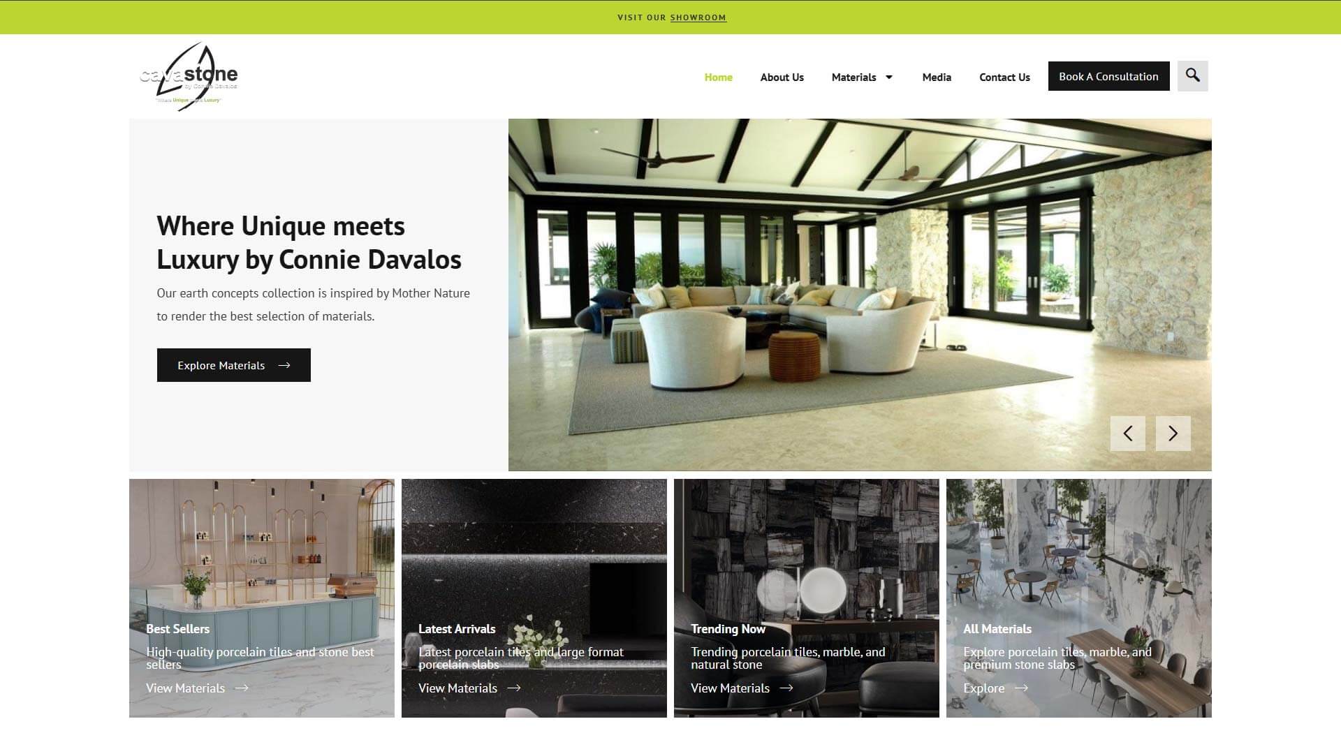
We created a refined visual experience that balances elegant imagery with practical navigation. Rather than overwhelming visitors with an extensive inventory, the website organizes materials into clearly defined categories such as porcelain, marble, granite, mosaics, onyx, limestone, travertine, recycled glass, and engineered materials.
Visitors can also explore curated groupings including Best Sellers, Latest Arrivals, and Trending Now, making it easier to discover both established favorites and current design trends.
Project Name
Luxury Tile & Natural Stone Website Design | Cavastone Boca Raton
Client
Cavastone
Our Role
Custom Website Design, WordPress Development, Product Catalogue Organization and Consultation-Focused User Experience
Industry
Luxury Tile, Natural Stone and Interior Design Materials
Author

What We Designed and Developed
A Visual Product Catalogue
The centrepiece of the website is its extensive materials catalogue. Products are arranged into logical categories so customers and design professionals can quickly narrow their search while still enjoying an image-led browsing experience.
The catalogue structure also gives Cavastone the flexibility to add new surfaces, collections, and product categories as its inventory evolves.
Organizing a Large and Diverse Collection
One of the most important parts of the project was creating a structure capable of supporting a substantial materials library.
The website presents hundreds of products across categories such as porcelain, porcelain slabs, marble, granite, quartzite, mosaics, limestone, onyx, textures, and other specialist surfaces. A scalable content structure makes this growing collection easier for Cavastone to manage and easier for customers to browse.
Clear categorization also strengthens search visibility by giving each material type a focused, relevant destination rather than placing the entire catalogue on a single general page.

From Product Browsing to Personal Consultation
The completed website positions Cavastone as more than a materials supplier. It presents the brand as a knowledgeable design partner with an extensive collection and a personalized approach.
Customers can now:
- Browse materials by type and collection
- Discover best sellers, new arrivals, and current trends
- View examples of Cavastone’s artistry
- Find the most convenient showroom
- Request a complimentary consultation
- Connect with the team according to their project role and needs
The result is a digital showroom that reflects Cavastone’s commitment to quality, creativity, and personalized service while giving the business a scalable platform for future collections and content.
The Final Result: A More Refined Path to the Perfect Surface
Cavastone’s website now brings its premium materials into a digital environment that feels elegant, organized, and approachable.
The new experience allows the beauty of each collection to speak for itself while guiding customers toward informed conversations with the Cavastone team. It connects online discovery with showroom consultation and provides a stronger foundation for the brand’s continued growth.
Because when the materials are designed to transform a space, the website showcasing them should feel just as considered.

November 13, 2023by Brenden Stefano
Hatcher’s Floors – A Class A Contractor
Hatcher's Floors - Laying Down the Groundwork for Digital Elegance
Case Study: Foundations of Excellence in partnership with Zulu Shack Creative
Step aside, red carpets, because Hatcher’s Floors is rolling out something even better. With a name that’s synonymous with top-tier flooring across Virginia, MD, and DC, they’re the craftsmen turning every walkway into a runway of quality and style.

A Legacy Built to Last
With over three decades of experience, Hatcher’s Floors doesn’t just cover ground; they elevate it. Rated sky-high on Angie’s List and Google Maps, they’ve got a track record that shines as brilliantly as their polished hardwoods.
Stepping Up to Superior Flooring Solutions
Hatcher’s Floors is where foot traffic meets fanfare. Whether it’s a cozy carpet or luxurious laminate, they’re the flooring aficionados ensuring that when you step into a room, it’s an entrance worth remembering.
Project Name
Hatcher’s Floors – A Class A Contractor
Client
Hatcher's Floors
Our Role
Branding, Web Dev, Custom Website, Consulting
Results
Free flow Communication between back office and website & Mobile Responsive Friendly website
Author

Crafting a Website That Works as Hard as Their Floors
Enter Zulu Shack Creative, where we took a WordPress theme and tailored it like a bespoke suit, infusing the brand with digital life. The result? A website with call-to-actions that don’t just whisper; they sing, they shout, they convert visitors into customers with the ease of a perfect parquet.
From Slow and Old to Fast and Bold
The old Hatcher’s Floors website? A relic. The new one? A revelation. We dusted off the cobwebs, sped up the pace, and gave it a purpose as clear and compelling as the gleaming floors they install.
The Grand Unveiling
Like the grand opening of a beautifully floored ballroom, Hatcher’s Floors and Zulu Shack Creative invite you to waltz into the digital age with us. It’s more than a website; it’s a showroom that never sleeps, a digital portfolio that stands the test of time and traffic.
Ready to take the next step? Let’s dance. 🕺🚀


November 13, 2023by Brenden Stefano
Sola Salons – Be Your Own Boss
Sola Salon Studios
Case Study: Shearing Through Digital Boundaries with Zulu Shack Creative

Snipping the Old, Styling the New
Sola Salon Studios is redefining what it means to be a hair stylist. Gone are the days of traditional salon constraints. Enter the era where stylists take the reins, courtesy of Sola’s unique salon ownership model.
The Zulu Shack Maneuver
At Zulu Shack Creative, we’re the stylists behind Sola’s digital hairstyle. Our SEO and organic strategies are the scissors and combs, shaping an online presence as bold and individual as the stylists Sola empowers.
Project Name
Sola Salons – Be Your Own Boss
Client
Sola Salon Studios
Our Role
Content Strategy and SEO
Author

Crafting the Digital Salon Suite
We didn’t just give Sola a trim; we orchestrated a full-blown digital makeover. Our SEO roadmap is the color palette to their canvas, bringing vibrancy and visibility to every stylist’s entrepreneurial dream.Tailored SEO: The Perfect Fit
Just as Sola tailors studios to each stylist, we customize SEO strategies for the perfect digital fit. We ensure that stylists searching for a space of their own find Sola at the top of their search, just like spotting the ideal salon from the street.The Organic Growth Salon
In the salon of digital marketing, our approach with Sola is holistic and nurturing. We’re growing their online presence organically, ensuring each stylist’s dream of independence is just a click away.Empowering Stylists, One Click at a Time
With Zulu Shack Creative’s digital strategy, Sola Salon Studios isn’t just a location; it’s a destination for stylists aspiring to carve their own path. It’s here that dreams are not only made but also discovered and realized. Here’s to crafting more than just hair — we’re crafting futures, one stylist, one studio, one dream at a time. 💇♀️💻🌟