

July 22, 2026by Muhammad Ishfaq
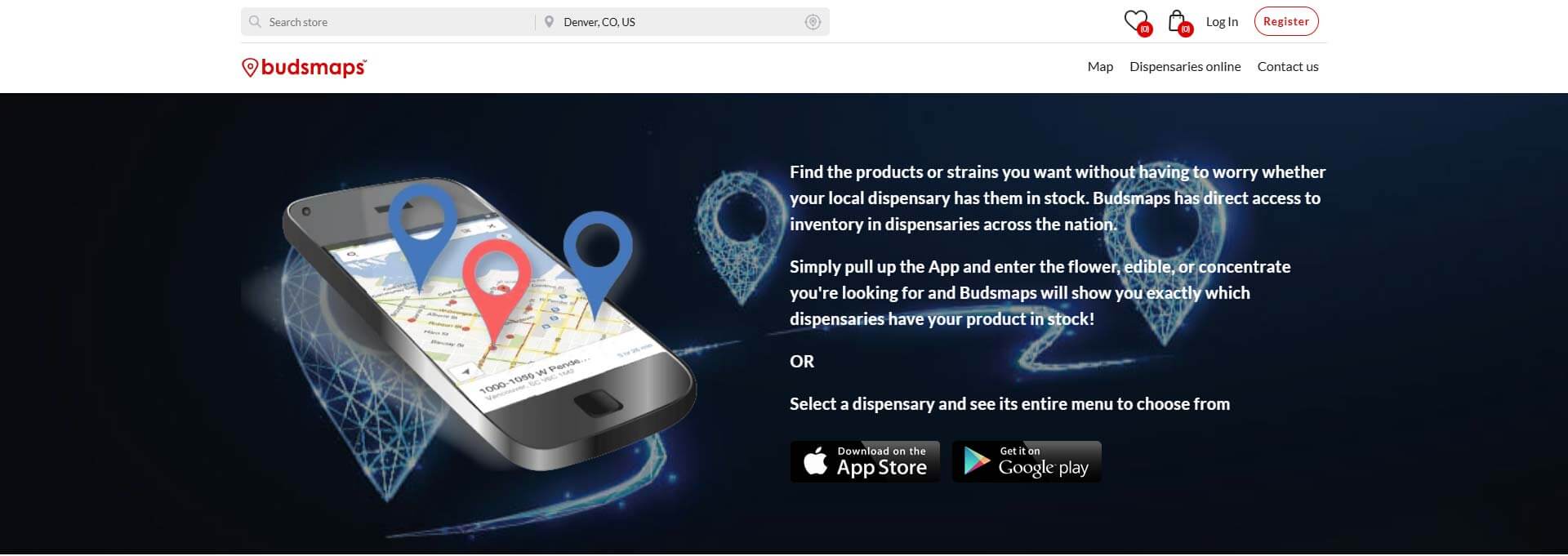
Budsmaps Cannabis Marketplace Platform
Case Study: Connecting Customers with Cannabis Dispensaries Through a Smarter Digital Marketplace
Finding Cannabis Shouldn't Feel Like a Treasure Hunt
Whether someone is searching for a nearby dispensary or looking for a specific strain, finding accurate inventory can often be frustrating. Menus change constantly, dispensaries carry different products, and outdated listings create unnecessary friction.
Budsmaps was created to bridge that gap—a marketplace where customers can discover licensed dispensaries, browse live menus, compare products, and place pickup orders with confidence.
The vision wasn’t simply another dispensary directory. It was a complete ecosystem that connects customers and dispensaries through one centralized platform.
Project Name
Budsmaps Cannabis Marketplace Platform
Client
Budsmaps
Our Role
Marketplace Architecture, Custom Web Development, Storefront Management
Industry
Cannabis Technology • Marketplace • eCommerce
Author
Building More Than a Directory
Creating Budsmaps meant solving two different challenges at once.
For customers, the platform needed to provide an intuitive way to search products, browse dispensaries, compare pricing, and locate inventory nearby.
For dispensary owners, it needed to function as a digital storefront that was easy to manage, allowing businesses to publish products, organize categories, update pricing, and increase visibility across the marketplace.
Every interaction had to remain fast, scalable, and simple regardless of how many stores or products were added.
Marketplace Architecture Built for Growth
Rather than creating static business listings, we developed a dynamic marketplace that combines directory functionality with modern eCommerce features.
The platform includes:
- Multi-location dispensary listings
- Individual storefront management
- Product catalog synchronization
- Category-based navigation
- Advanced filtering and search
- Pickup ordering workflows
- Membership plans for dispensaries
- Customer accounts and wishlists
- Fully responsive shopping experience
The result is a system that benefits both consumers and business owners while remaining flexible for future expansion.

Helping Customers Discover Products Faster
The user experience was designed around discovery.
Customers can browse featured dispensaries, search by location, explore product categories, compare available inventory, and quickly navigate to individual storefronts without unnecessary clicks.
By simplifying the shopping journey, Budsmaps helps customers spend less time searching and more time finding exactly what they need.
Designed to Scale Alongside the Industry
Marketplace platforms grow quickly, so scalability was a priority from day one.
The system was architected to support:
- Hundreds of dispensaries
- Thousands of products
- Location-aware searching
- Large product catalogs
- Mobile shopping
- Continuous platform expansion
As new businesses join the marketplace, performance remains smooth and reliable for every visitor.
Results: A Marketplace That Benefits Everyone
Budsmaps transformed the cannabis shopping experience into a modern, easy-to-use digital marketplace.
Customers can discover products faster, compare dispensaries, and shop with confidence, while dispensaries gain greater online visibility, simplified product management, and new opportunities to reach local customers.
By combining marketplace technology, eCommerce functionality, and scalable architecture into one platform, Budsmaps established a strong foundation for long-term growth in an evolving industry.
July 21, 2026by Muhammad Ishfaq
Custom Shopify Health-Testing Platform | Unilab Health
Case Study: Bringing Decades of Laboratory Expertise Directly into the Home
From a Trusted Clinical Laboratory to an Accessible Consumer Health Platform
For decades, Unilab Health worked behind the scenes—supporting clinics, healthcare professionals, and reproductive-health programs with accurate laboratory testing.
Its next chapter required a completely different kind of experience.
Rather than serving only medical providers, Unilab wanted individuals to access professionally analyzed blood testing from home. Customers needed to be able to choose an appropriate test, order a collection kit online, collect their sample privately, return it to the laboratory, and securely review their results without the inconvenience of visiting a traditional clinic.
The challenge was not simply to launch an online store. It was to translate the credibility of an established laboratory into a clear, reassuring, and easy-to-use consumer journey.
Project Name
Custom Shopify Health-Testing Platform | Unilab Health
Client
Unilab Health
Our Role
Shopify Website Development, E-Commerce Experience, Product Architecture, User-Journey Design and Responsive Implementation
Industry
Healthcare, Laboratory Testing and Consumer Wellness
Author
More Than an At-Home Device
The platform needed to clearly distinguish Unilab Health from products that generate results entirely through a home device.
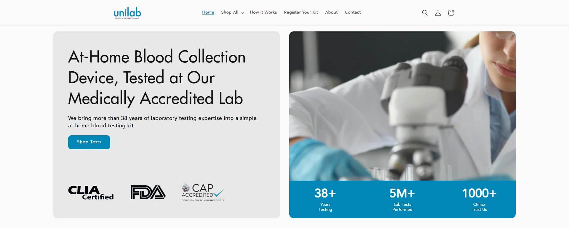
Customers collect their blood sample at home, but the sample is returned to Unilab’s laboratory for professional analysis by trained personnel. The website repeatedly reinforces this distinction through its messaging, process explanations, laboratory imagery and institutional trust signals.
This became a central part of the digital strategy
By explaining what happens behind the kit, the platform turns an unfamiliar health product into a process customers can understand and trust.

Turning a Medical Workflow into Four Clear Steps
Laboratory testing can involve unfamiliar procedures, logistical requirements and sensitive personal information. The website simplifies that journey into four understandable stages:
1. Purchase a Test
Customers select and order a health panel online. Unilab states that a medical professional reviews the order before the kit is dispatched.
2. Register the Kit
Once received, the kit must be registered so the sample can be accurately connected to the customer and processed without unnecessary delays.
3. Collect and Return the Sample
Customers follow the provided instructions, collect their sample at home and return it using the prepaid mailing envelope.
4. Review the Results
After the laboratory receives the sample, results for most tests are made available through the customer’s private account, generally within three to four days.
Presenting the experience this way reduces uncertainty and helps customers know exactly what will happen before they place an order.
Building Trust into Every Stage of the Experience
Trust is particularly important when customers are collecting blood and submitting sensitive health information.
The website supports credibility through several layers:
- The company’s decades-long laboratory history
- More than five million reported laboratory tests
- Relationships with over 1,000 clinics
- Laboratory and regulatory trust markers
- Real laboratory and technician imagery
- Clear explanations of how samples are handled
- Secure customer accounts for reviewing results
- Product-specific customer feedback
Unilab’s history also gives the brand a meaningful origin. The company traces its roots to reproductive medicine, was formally founded in 1988 and later expanded into donor screening before entering at-home testing in 2024.
Rather than relying only on marketing claims, the site shows that the consumer platform is supported by an established clinical operation.

Making Clinical Information Feel Approachable
The visual direction avoids making the experience feel overly clinical or intimidating.
A restrained blue-and-white palette, spacious layouts, health-focused photography and simple typography create an interface that feels professional without resembling a hospital portal.
Product cards use recognizable wellness categories and lifestyle imagery, while laboratory photography appears in credibility-focused sections. This balance supports two important customer emotions:
- Confidence that the science is legitimate
- Comfort that the process is manageable
The responsive design also makes it possible to research tests, review the collection process and complete a purchase from mobile devices.

Organizing Health Tests Around Real Customer Needs
The product catalogue was structured around three broad pathways:
- Women’s Health
- Men’s Health
- Total Health
Within those pathways, customers can explore focused panels covering areas such as ovarian reserve, thyroid health, testosterone, sports performance, nutrition, metabolism and fatigue. The platform also includes a Create Your Own Panel option for customers seeking a more personalized selection of biomarkers.
This structure moves the experience away from a confusing catalogue of laboratory codes and toward familiar health goals customers can understand.
The Result: Professional Lab Testing Without the Traditional Clinic Visit
The completed platform gives Unilab Health a direct-to-consumer experience that reflects the standards of its laboratory while removing many of the barriers associated with conventional blood testing.
Customers can now:
- Explore tests by health goal
- Compare available panels
- Purchase securely online
- Learn how the collection process works
- Register their kits
- Return samples using prepaid packaging
- Receive professionally analyzed results through a private account
- Use those results to begin more informed conversations about their health
The result is a healthcare-commerce platform that makes laboratory testing easier to access without presenting it as a disposable consumer gadget.
July 21, 2026by Muhammad Ishfaq
Custom WordPress Website Design for Women’s Healthcare Practice | Women’s Healthcare of Boca Raton
Case Study: Creating a Digital Experience That Supports Women Through Every Stage of Life
Healthcare Begins with Trust Long Before the First Appointment
Choosing a healthcare provider is one of the most personal decisions a patient can make.
Whether someone is scheduling their first gynecological visit, preparing for pregnancy, navigating menopause, or exploring women’s wellness treatments, they want more than medical expertise—they want reassurance, compassion, and confidence.
Women’s Healthcare of Boca Raton has spent years providing comprehensive obstetric and gynecological care with a patient-first philosophy that emphasizes education, personalized treatment, and long-term relationships.
The website needed to reflect those same values while making healthcare information easier to understand and appointments easier to schedule.
Project Name
Custom WordPress Website Design for Women’s Healthcare Practice | Women’s Healthcare of Boca Raton
Client
Women's Healthcare of Boca Raton
Our Role
Custom WordPress Website Design, UX/UI Design, Healthcare Website Development, Patient Journey Optimization, Responsive Development
Industry
Women's Healthcare & Obstetrics
Author
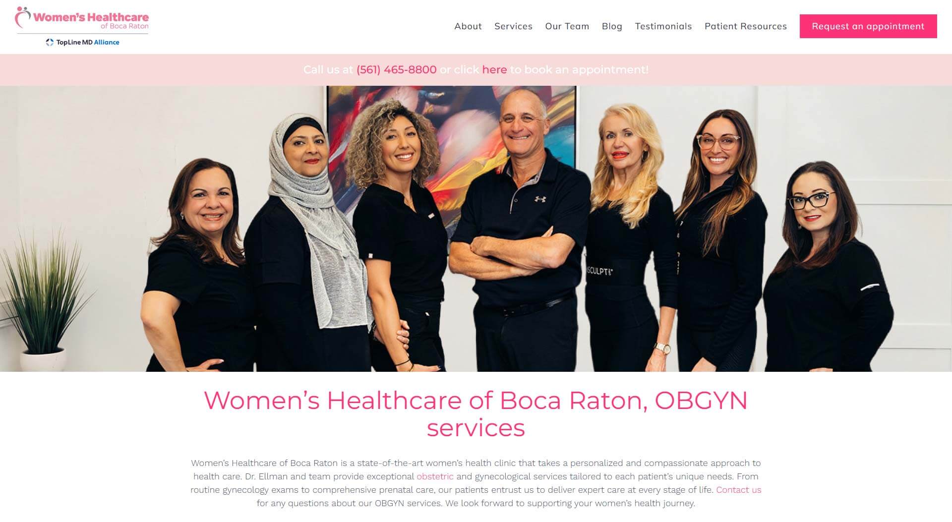
Expanding Beyond Traditional Women’s Healthcare
The practice offers more than routine OB/GYN services.
The website also introduces advanced wellness technologies including Emsculpt Neo for body contouring and Emsella for pelvic floor strengthening and urinary incontinence treatment.
Dedicated landing sections explain these innovative treatments using approachable language, helping patients understand available options while reinforcing the practice’s commitment to comprehensive women’s wellness.
Rather than feeling disconnected from the rest of the website, these services are naturally integrated into the overall patient journey.

Designing Around the Patient Experience
Healthcare websites often overwhelm visitors with clinical terminology and complex navigation.
For Women’s Healthcare of Boca Raton, the objective was different.
The website was designed to create a welcoming digital environment where patients immediately feel informed, comfortable, and supported.
Clean layouts, calming imagery, soft color palettes, and thoughtfully organized content help reduce anxiety while making important healthcare information easier to access.
Every interaction encourages confidence before a patient ever walks into the office.
Organizing Care Around Every Stage of Life
One of the website’s greatest strengths is how it organizes services around the evolving healthcare needs of women.
Rather than presenting a long list of medical procedures, the platform introduces patients to comprehensive care that spans every stage of life, including:
- Annual wellness exams
- Pregnancy and obstetric care
- Family planning
- Preventive women’s healthcare
- Menopause management
- Gynecological treatments
- Wellness and intimate health solutions
This patient-focused structure allows visitors to quickly identify the care most relevant to their current stage of life while encouraging ongoing relationships with the practice.

Building Confidence Through the Physician’s Story
Healthcare is personal, and patients often choose providers based on trust.
The website highlights Dr. David Ellman’s experience, philosophy, and commitment to personalized care through an engaging physician profile that helps visitors feel connected before scheduling their first appointment.
Professional photography, approachable messaging, and authentic storytelling reinforce the human side of the practice while demonstrating decades of medical expertise.
Results
The completed website reflects the compassionate, patient-centered philosophy that defines Women’s Healthcare of Boca Raton.
Visitors can easily explore services, learn about treatment options, meet the physician, and schedule appointments through an experience designed to educate, reassure, and build lasting trust.
By combining thoughtful design, organized healthcare content, and modern functionality, the platform strengthens the practice’s digital presence while supporting women through every stage of their healthcare journey.

July 20, 2026by Muhammad Ishfaq
Custom WordPress Website Design for Criminal Defense Law Firm | Kim & LaVoy
Case Study: Building a Digital Presence That Inspires Confidence Before the First Consultation
When Your Reputation Is Built in the Courtroom, Your Website Should Reflect It
For most businesses, a website introduces a company.
For a criminal defense law firm, it introduces trust.
People searching for legal representation are often facing one of the most stressful and uncertain moments of their lives. They aren’t simply looking for an attorney—they’re looking for confidence, experience, and someone capable of protecting their future.
Kim & LaVoy has built its reputation by providing strategic criminal defense throughout Milwaukee, Waukesha, Washington, and Ozaukee Counties. The firm’s website needed to communicate that same professionalism while making legal guidance feel accessible and reassuring from the very first visit.
Project Name
Custom WordPress Website Design for Criminal Defense Law Firm | Kim & LaVoy
Client
Kim @ LaVoy, S.C.
Our Role
Custom WordPress Website Design, UX Strategy, Responsive Development, Content Architecture, Performance Optimization
Industry
Criminal Defense Law
Author
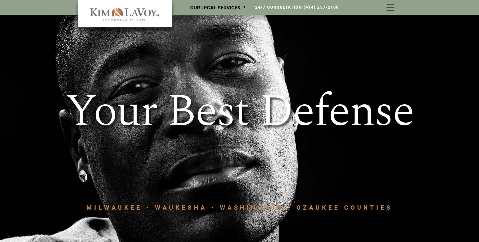
Designing Around Trust Instead of Fear
Many legal websites rely on aggressive messaging or overwhelming visitors with legal terminology.
For Kim & LaVoy, the objective was different.
The website was designed to establish confidence through clarity, professionalism, and experience. From the opening message, visitors are introduced to a firm focused on honest assessments, straightforward answers, and practical legal guidance rather than unnecessary complexity.
The clean visual hierarchy, refined typography, and restrained color palette reinforce the firm’s reputation while creating an experience that feels both approachable and authoritative.
Presenting Legal Services with Clarity
Criminal law covers a wide range of cases, and visitors often arrive with an urgent need for answers.
To simplify navigation, the website organizes practice areas into clearly defined categories, allowing prospective clients to quickly identify services related to DUI defense, domestic violence, drug offenses, theft, federal crimes, white-collar investigations, juvenile matters, traffic violations, and other criminal defense areas.
Instead of requiring visitors to search through extensive legal content, the platform helps them reach the information they need with minimal effort.

Building Credibility Through Experience
One of the strongest aspects of the website is its emphasis on the firm’s background and courtroom experience.
Attorney profiles, professional achievements, media appearances, client testimonials, and recognition throughout the legal community work together to reinforce the firm’s credibility before a consultation is ever scheduled.
The platform also highlights the unique perspective gained through prosecutorial experience, demonstrating how that insight benefits clients facing criminal charges.
Humanizing the Legal Experience
While legal expertise is essential, trust is often built through personal connection.
The website introduces visitors to the attorneys behind the firm through professional photography, individual biographies, and authentic storytelling that reflects both experience and accessibility.
Combined with video content, educational resources, and media features, these elements help prospective clients feel they are speaking with real people—not simply reading another law firm website.
A Former Prosecutor’s Perspective
One of our firm’s greatest strengths is the experience that attorney Julius Kim brings. As a former Assistant District Attorney for Milwaukee County who prosecuted a wide variety of crimes, he provides a unique perspective that has shaped our firm’s philosophy and benefits all of our clients. With his experience, our attorneys have greater insight into a prosecutor’s strategies and concerns during the investigatory phase of a case, as well as during plea negotiations and trials.
Creating a Strong Local Presence
Serving multiple counties across Wisconsin, the website was structured to strengthen local visibility while making it easy for prospective clients to connect with the firm.
Dedicated service areas, clear contact information, office locations, and streamlined consultation pathways ensure visitors can quickly take the next step when legal assistance is needed.
The result is a digital experience that supports both user convenience and long-term search visibility.
Built for Long-Term Growth
As the firm continues expanding its legal resources, news coverage, attorney profiles, and educational content, the website provides a flexible platform capable of supporting ongoing growth.
New practice areas, legal articles, case updates, and media appearances can be added without compromising the site’s structure, allowing the platform to evolve alongside the firm’s reputation.
Results
The completed website reflects the professionalism, experience, and integrity that define Kim & LaVoy.
Visitors can confidently explore legal services, learn about the attorneys, understand the firm’s approach, and request guidance through a user-friendly experience that balances authority with accessibility.
By combining thoughtful design, strategic content organization, and trust-focused messaging, the platform reinforces the firm’s position as a respected criminal defense practice serving communities throughout southeastern Wisconsin.

Final Thoughts
When someone searches for a criminal defense attorney, they’re looking for more than legal representation—they’re looking for reassurance during one of the most difficult moments of their lives.
The website was designed to provide that reassurance from the very first interaction, transforming courtroom experience into a digital experience built on confidence, clarity, and trust.
Today, Kim & LaVoy has a platform that reflects the strength of its legal practice while helping prospective clients take the first step toward protecting their future.
July 20, 2026by Muhammad Ishfaq
Custom WordPress Website for Franchise Consultant | Your Future Franchise
Case Study: Creating a Digital Platform That Gives Future Franchise Owners Confidence
Every Great Franchise Journey Starts with the Right Guide
Buying a franchise is one of the biggest financial and lifestyle decisions someone can make.
Yet most prospective franchise owners begin their search the same way—scrolling through endless opportunities, comparing brands, reading conflicting advice, and wondering if they’re making the right decision.
Your Future Franchise was built to change that.
Instead of asking people to navigate the franchise world alone, the business provides one-on-one guidance that helps entrepreneurs discover opportunities aligned with their experience, goals, budget, and lifestyle.
The website needed to communicate that this wasn’t simply another franchise directory—it was a personal coaching experience led by someone who had spent years helping people make smarter business decisions.
Project Name
Custom WordPress Website for Franchise Consultant | Your Future Franchise
Client
Your Future Franchise
Our Role
Custom WordPress Website Design, UX Strategy, Lead Generation, Personal Brand Development, Content Architecture
Industry
Franchise Consulting
Author
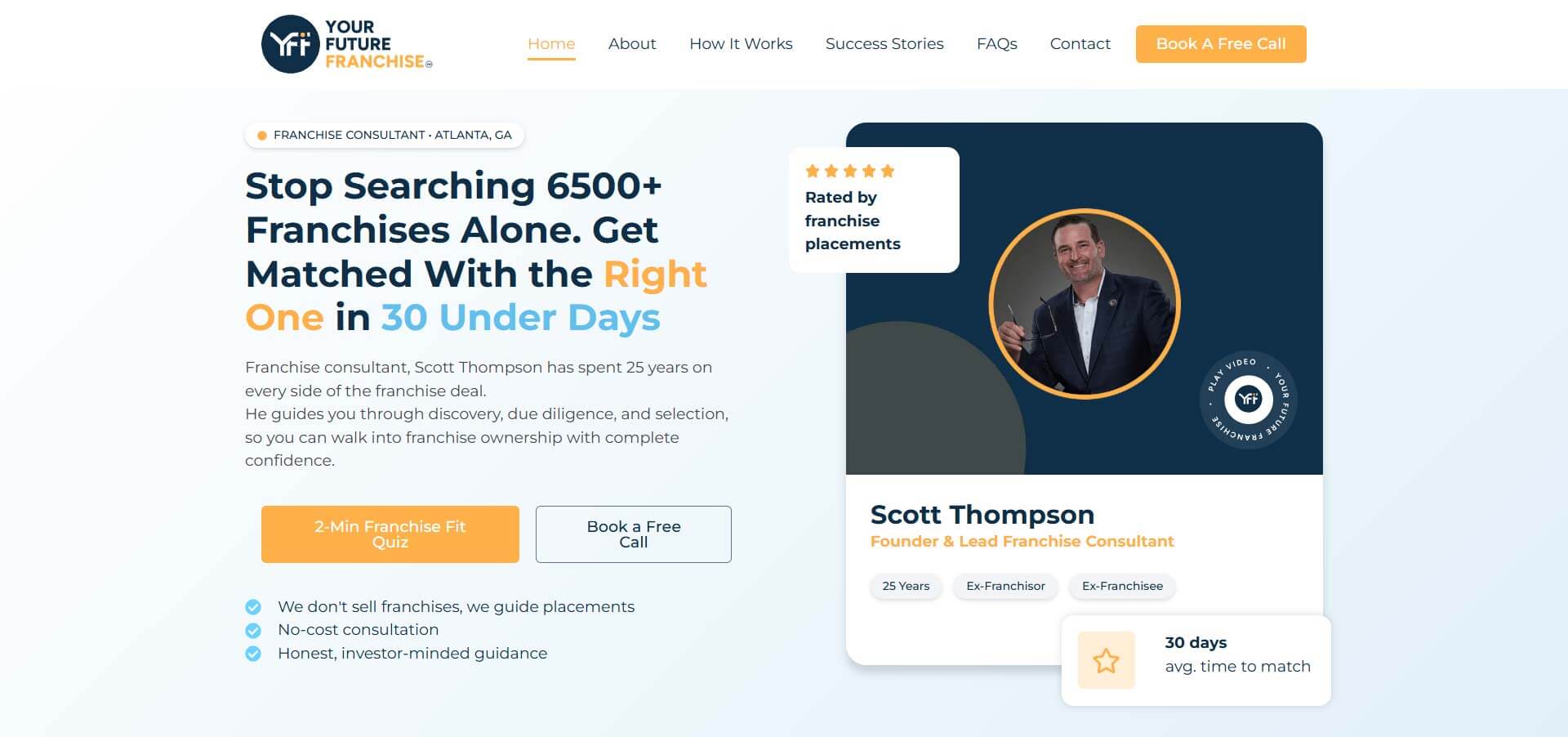
Simplifying a Complex Decision Through a Proven Process
One of the strongest elements of the platform is its clearly defined 7-Step Franchise Success Process.
Rather than leaving visitors wondering what happens after booking a consultation, the website walks them through every stage of the journey—from the initial discovery call to researching opportunities, validating decisions, and ultimately launching their business.
Breaking the process into manageable milestones removes uncertainty and helps visitors feel more confident before taking the next step.
Education Before Investment
Buying a franchise should never feel like a sales pitch.
The website reflects this philosophy by providing educational resources that help prospective franchise owners understand the process before making any commitments.
Visitors can explore articles, videos, FAQs, and downloadable resources designed to answer common questions, explain franchise ownership, and prepare them for meaningful conversations.
This educational approach builds trust while positioning Your Future Franchise as a long-term partner rather than simply a lead-generation business.

A Website Built Around Education
Business owners often avoid IT because the industry feels complicated.
To remove that barrier, the website introduces educational resources including FAQs, practical articles, technology insights, and “Tech for Humans” content that explains complex topics using everyday language.
By educating visitors before asking for a consultation, the platform establishes credibility while making technology feel approachable instead of intimidating.
Personal Branding That Builds Confidence
Unlike corporate franchise networks, this business is built around the expertise of its founder.
The website places a strong emphasis on Scott’s background, experience, and success helping entrepreneurs navigate the franchise landscape.
Client testimonials, personal insights, educational videos, and professional achievements are woven throughout the experience, creating a stronger human connection and reinforcing the value of personalized guidance.
Turning Visitors Into Qualified Consultations
Every page was designed with a clear objective:
Encourage visitors to take the next step with confidence.
Strategically positioned calls-to-action, downloadable resources, consultation booking opportunities, and educational content work together to nurture visitors before they ever schedule a conversation.
Rather than generating large volumes of enquiries, the platform focuses on attracting informed prospects who are genuinely ready to begin their franchise journey.

Results
The completed platform positions Your Future Franchise as more than a consulting business.
It serves as an educational hub, a trusted resource, and a personal coaching platform for aspiring franchise owners.
By combining thoughtful storytelling, educational content, and a clearly defined client journey, the website helps remove uncertainty from one of life’s biggest business decisions while building stronger relationships before the first consultation ever takes place.
Final Thoughts
Choosing a franchise shouldn’t feel like taking a gamble.
The website was designed to replace confusion with clarity, uncertainty with education, and hesitation with confidence.
Today, Your Future Franchise has a digital platform that reflects its core mission—helping entrepreneurs discover franchise opportunities with expert guidance, proven processes, and the confidence to move forward.

July 20, 2026by Muhammad Ishfaq
Custom WordPress Website for Managed IT Services | Third-Eye Tech
Case Study: Helping Small Businesses Stop Fighting Technology and Start Growing
Building Trust Before the First Support Ticket
Most IT companies talk about servers, networks, firewalls, and technical specifications.
Third-Eye Tech starts somewhere different.
They start with business owners.
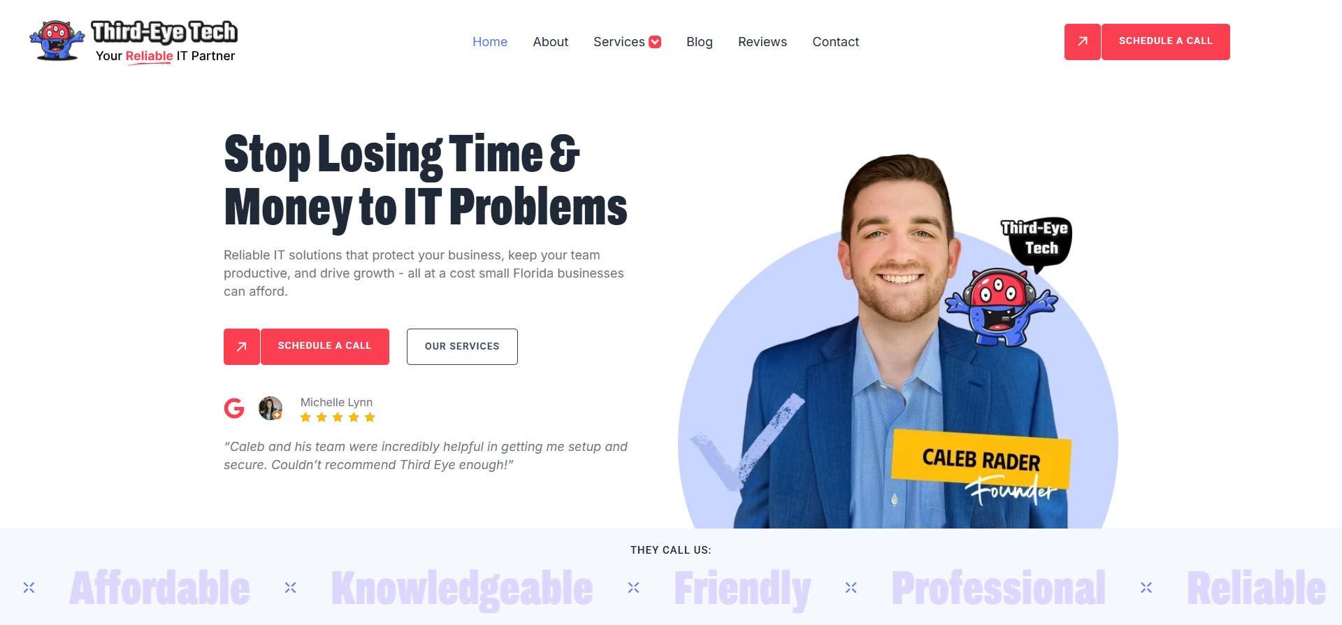
The homepage immediately addresses the real frustrations small businesses experience—lost productivity, expensive downtime, cybersecurity threats, and unpredictable IT costs—before introducing technology as the solution.
This creates an immediate emotional connection with visitors who aren’t looking for complicated technical explanations—they simply want reliable technology that allows them to focus on running their business.
Project Name
Custom WordPress Website for Managed IT Services | Third-Eye Tech
Client
Third Eye-Tech
Our Role
Custom WordPress Website Design, UX Strategy, Lead Generation, SEO Architecture, Performance Optimization
Industry
Managed IT Services & Cybersecurity
Author
Turning Cybersecurity Into Something Anyone Can Understand
One of the standout features of the website is the free Cyber Score Assessment.
Rather than asking visitors to contact the company before understanding their security risks, the website offers an interactive tool that allows businesses to evaluate their online security posture in just a few minutes.
This transforms cybersecurity from an abstract concept into something practical, educational, and immediately valuable.
Instead of creating another lead form, the website delivers useful information first.

A Website Built Around Education
Business owners often avoid IT because the industry feels complicated.
To remove that barrier, the website introduces educational resources including FAQs, practical articles, technology insights, and “Tech for Humans” content that explains complex topics using everyday language.
By educating visitors before asking for a consultation, the platform establishes credibility while making technology feel approachable instead of intimidating.
Positioning IT as a Business Investment
Throughout the website, technology is presented as more than technical support.
Every service is connected to a measurable business outcome.
Instead of simply listing IT services, the platform explains how proactive technology helps businesses:
- Prevent costly downtime
- Improve employee productivity
- Strengthen cybersecurity
- Support future growth
- Reduce long-term operating costs
This consultative approach positions Third-Eye Tech as a strategic technology partner rather than just another managed service provider.
Showcasing Services Without Technical Jargon
Rather than overwhelming visitors with technical terminology, the website organizes its services around real business challenges.
Visitors can easily discover solutions for:
- Managed IT Support
- Cybersecurity & Compliance
- Cloud Migration
- Microsoft 365
- Data Backup & Disaster Recovery
- VoIP Phone Systems
- AI Strategy & Planning
Each service explains the business value first, followed by the technical solution—making it easier for non-technical decision-makers to understand how each offering supports their organization.

Results
The completed platform positions Third-Eye Tech as more than an IT provider.
It reflects the company’s mission of helping small businesses stay secure, productive, and prepared for future growth.
By combining educational content, practical tools, and a consultation-first user journey, the website transforms complex technology into clear business solutions that business owners can understand and trust.
Final Thoughts
The best IT support isn’t measured by how quickly problems get fixed.
It’s measured by how many problems never happen in the first place.
The new Third-Eye Tech website communicates exactly that philosophy—helping business owners see technology not as a constant source of frustration, but as a reliable partner for long-term success.

November 6, 2025by Brenden Stefano
Custom WordPress Website Redesign | Conrad Marine T.A.P. Fin Technology
Case Study: Conrad Marine Gets a Website Worthy of Its Fins
Meet Goofy: The Man Who Made Pontoons Cool
You know how most people look at a pontoon boat and think, “Ah yes, floating patio furniture”?
Not Goofy.
Goofy saw potential. He saw hydrodynamics. He saw… fins.
Not just any fins — T.A.P. Fins, a patented system that makes pontoons ride smoother, turn sharper, and handle like they’ve been sneaking protein shakes.
In short: the man reinvented the way pontoons move.
But his website? Yeah, it hadn’t moved since 2004.
The old site had that “built in the age of My Chemical Romance and dial-up tones” aesthetic. It worked well — kind of like an old outboard motor that still sputters to life — but it wasn’t exactly making waves online.
That’s when Zulu Shack Creative entered the chat. (Thanks again to Kim, our referral MVP, who keeps introducing us to absolute legends.)
Project Name
Custom WordPress Website Redesign | Conrad Marine T.A.P. Fin Technology
Inventor
Goofy (yes, that’s really his name, and no, he’s not a cartoon character — he’s a marine engineering wizard)
Industry
Marine Innovation / Pontoon Performance
Our Role
Custom WordPress Theme, Elementor, Collaborative Developer Handoff
Author
Mission: Make It Look as Smart as It Is
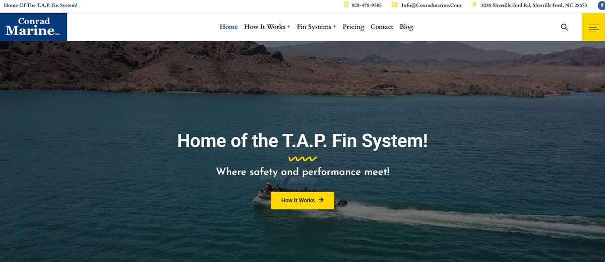
Goofy’s tech was cutting-edge. His site? Not so much. Our goal was simple — make Conrad Marine look as advanced as the engineering behind the fins.
We designed a fully custom WordPress theme that’s sleek, confident, and built for performance — kind of like the boats Goofy helps upgrade.
The new design ditched the old-school clutter for:
- Clean, modern layouts that highlight the T.A.P. Fin system like the innovation it is.
- Clear storytelling that finally explains what these fins do without making you feel like you need a PhD in fluid dynamics.
- Basic SEO structure ready for Kim and performance tweaks, because genius doesn’t mean much if nobody can find you.
We also made sure the design had some personality — a little grit, a little shine, a touch of Goofy’s inventor energy. You can practically smell the sawdust and saltwater when you scroll.
The Hand-Off: Collaboration, Not Control
Now here’s the twist: once we finished designing and developing the new site, we handed it over to Goofy’s longtime web developer — the guy who’s been keeping the lights on since before TikTok existed.
Why? Because we actually like working with people, not taking over their turf. At Zulu Shack Creative, we’re all about collaboration. You’ve got a team? Awesome. We’ll fit right in, teach what we know, and leave things better than we found them.
It’s kind of like being digital foster parents — we raise the project, get it walking and talking, then hand it back when it’s ready to live its best life.
Results: From Old-School to Oh Damn
The new conradmarine.com looks and performs like a completely different species. It’s clean, fast, and finally reflects what the product actually is — smart, innovative, and low-key brilliant.
Visitors now land on the site and think, “Wait, I need fins on my pontoon.”
Because yes, they do.
We gave Goofy a modern digital platform that matches his patented performance — the kind of site that makes people go from “What’s a T.A.P. Fin?” to “Take my money” in about 30 seconds.

November 6, 2025by Brenden Stefano
SEO Strategy + PPC Landing Pages | Creative Love Surrogacy Agency
Case Study: Growing a Compassionate Brand in a Competitive Space
The Backstory: Where Business Meets Heart
Few industries balance science, emotion, and trust like surrogacy — and Creative Love does it with grace.
Founded by Wendy, a powerhouse businesswoman with empathy baked into every decision, Creative Love has helped families from around the world begin their fertility journeys with care, clarity, and confidence.
When Zulu Shack Creative partnered with Wendy, we weren’t just working on another WordPress site — we were helping amplify a mission built on love, inclusivity, and hope.
Her agency already had a solid foundation, but the digital landscape around it was shifting. It was time to strengthen the brand’s visibility, performance, and lead generation — setting the stage for long-term growth.
Project Name
SEO Strategy + PPC Landing Pages | Creative Love Surrogacy Agency
Client
Wendy - Creative Love Egg Donor & Surrogacy Agency
Our Role
SEO Optimization SEO Strategy, WordPress, Elementor, WPForms, Google Ads, Location Page Buildouts, Premium Hosting
Author

What We Did: Strength Meets Strategy
First, we stabilized the core. Wendy’s previous site came to us like a slightly over-loved houseplant — healthy roots, a little droopy around the edges. So, we:
- Moved her WordPress site to a high-performance hosting environment, boosting speed, reliability, and uptime.
- Refined the site’s structure and user flow, making it easier for intended parents, surrogates, and donors to find what they need.
- Built out optimized location pages to improve organic search visibility across Florida and beyond.
Then came the real momentum: SEO + PPC (Pay Per Click Advertising)
SEO Strategy That Builds Trust
We developed a long-term SEO strategy focusing on keyword depth, local relevance, and intent-based content. Each new page — from city-specific surrogacy guides to educational blog posts — was crafted to attract the right audience and build authority in Google’s eyes (and hearts).
PPC That Converts with Empathy
For paid traffic, we created dedicated landing pages tailored for Google Ads campaigns — written and designed to convert without feeling transactional. In an industry built on compassion, we found the balance between marketing and meaning.
Together, the SEO and PPC efforts are driving measurable lead growth while keeping acquisition costs efficient — proof that even the most sensitive industries can thrive with smart, authentic digital marketing.
Results: A Relationship That Keeps Growing
Under Zulu Shack Creative’s ongoing management, Creative Love’s website performance and visibility have improved steadily. Organic rankings continue to climb, and PPC conversions are more consistent than ever — helping more families connect with the agency each month.
The next chapter is already in the works. Wendy has commissioned a brand-new website, fully custom-built by Zulu Shack Creative, launching in early 2026. It’s going to be a fresh design with modern UX, elevated visuals, and an SEO-forward framework that matches Creative Love’s reputation and heart.
For Zulu Shack Creative, partnering with Wendy has been a reminder that great marketing doesn’t just attract clicks — it connects humans. And we’re proud to keep that connection growing.


November 6, 2025by Brenden Stefano
Custom WordPress Website + Branding | Tracy Nagle Immigration Law
Case Study: One Lawyer, One Dream, One Seriously Determined Website
The Setup: A Lawyer, a Leap, and a Budget
When Tracy Nagle launched her own immigration law practice, she was stepping into a new phase — from attorney to full-blown business owner. Her mission: help clients from around the world — including South Africa, Israel, Canada, Europe, Australia, and the U.K. — navigate the often-overwhelming process of moving to the United States.
It’s meaningful work with high stakes — but her digital presence needed to catch up. Tracy came to Zulu Shack Creative looking for a brand identity and a website that felt polished, trustworthy, and professional… without blowing through a startup budget.
Let’s just say, expectations were high and timelines were tight. (We’ve been in calmer client relationships with our coffee machines.)
Project Name
Custom WordPress Website + Branding | Tracy Nagle Immigration Law
Client
Tracy Lee Nagle Law PLLC
Our Role
WordPress, Elementor, WPForms, Logo Design, WordPress Training
Author

WordPress on a Mission
We built Tracy a custom WordPress website in Elementor, balancing sleek design with startup practicality. The site had to look credible enough for corporate visas and approachable enough for family immigration cases — a digital handshake that says, “You’re in good hands.”
We also created her brand identity, keeping it refined and modern — professional, not pretentious. And very purple, Tracy loves purple. Clean typography, and a calming color palette gave it a unique tone in a field that often feels cold and rigid.
Because we believe empowerment beats dependency, we included a full WordPress training session as part of her launch. Tracy learned how to manage her own content, forms, and updates — along with a plugin toolkit for SEO, security, and performance.
(She’s since taken the reins on hosting and updates. We’ve noticed a few things wobble since, but hey — every lawyer needs a first case, and every site needs a first “oops.”) to learn, we encourage this.
Results: The Legal Launchpad
The finished site gave Tracy exactly what she needed — a strong, credible online foundation for her new firm. It’s professional, fast, and mobile-friendly, designed to grow as her business and caseload expand.
Even with limited resources, we helped her start with something that looked premium and performed like it too — proof that a great website doesn’t need a big budget, just a clear vision and a team that knows how to stretch pixels like dollars.
November 6, 2025by Brenden Stefano
Wix Migration to Custom WordPress Website | Creative Roots Media
Case Study: Helping Creative Roots Media Take Root (Digitally)
The Setup: From Wix to Wow
Let’s set the scene. 🎬
Creative Roots Media, founded by Staci Talley, had the experience, the clients, and the camera skills to make any brand look good on screen — but her old website wasn’t giving that same energy.
Built on Wix, it didn’t quite capture Staci’s creative range or her professional edge. And in an industry that’s still far too “boys’ club,” she needed a space that amplified her expertise — feminine but fierce, elegant but grounded, confident without needing to shout.
Her request was simple:
“I need a site that looks like my work feels.”
So, Zulu Shack Creative rolled up our digital sleeves, brewed something strong, and built her an online presence worthy of prime time.
Project Name
Wix Migration to Custom WordPress Website | Creative Roots Media
Client
Staci Talley - Creative Roots Media
Our Role
Custom WordPress, Elementor, WPForms, Logo Design
Author

New Brand, New Site, Same Staci Energy
We started by ditching Wix (because, well… it was Wix) and rebuilding Creative Roots Media on a custom WordPress framework. Using Elementor, we crafted a fully bespoke site that mirrored Staci’s creative eye — cinematic visuals, refined typography, and a color palette that walks that perfect line between bold and graceful.
But we didn’t stop there…
🎬 Custom Brand Design
We designed a brand-new logo and identity system for Creative Roots Media — one that feels modern, confident, and unmistakably Staci. It’s the kind of logo that says, “Yes, I direct commercials and command crews — and I look good doing it.”
🌐 Performance & SEO
We built the site with performance and visibility in mind. Optimized for speed, search, and mobile, the new Creative Roots Media website doesn’t just look like Hollywood — it acts like it too.
🧭 Strategic Navigation & UX
The layout showcases Staci’s work front and center while keeping her digital strategy services easy to explore. Every page leads visitors naturally toward her portfolio or contact forms — no click chaos, no fluff.Results: Standing Ovation-Worthy Feedback
When Staci saw her new site, her reaction was instant: she loved it. The site hit that exact balance she wanted — professional and strong, with a distinct feminine confidence that reflects who she is as a filmmaker and creative entrepreneur.
Now, her online presence finally matches her on-set authority. She’s been booking more high-quality leads, showcasing her reel with pride, and positioning Creative Roots Media as a go-to creative partner for both local and national brands.
And yes, her new logo looks fantastic on business cards, camera cases, and maybe one day… her own production slate.
That’s a Wrap
For Zulu Shack Creative, this one was about more than web design — it was about helping a voice in film cut through the static. The new Creative Roots Media brand and website don’t whisper; they speak clearly, confidently, and with just the right amount of cinematic flair.
