
A good restaurant dashboard should be useful to someone who has a shift to run.
That sounds obvious. It is also a demanding brief. The information may come from several systems, the person reading it has other work to do, and a colorful graph cannot cover the lunch rush.
Refresh Miami’s April 20, 2026 profile of Clave offers an interesting local example.1 It describes brothers Tadeo and Mateo Acosta-Rubio growing up in the family business, ChurroMania, which the report identifies as a franchise with more than 140 locations across ten countries. Their Miami startup focuses on bringing restaurant operating information together.
The detail that interests me is the operating background. Software decisions look different when you understand what a store manager is trying to get through before the next shift.
Review the decision the screen is meant to support
Consider a hypothetical operator with several restaurant locations. This example is a design exercise, not a description of Clave’s product or a Zulu Shack client.
The operator wants to spot a location that needs attention and understand what to do next.
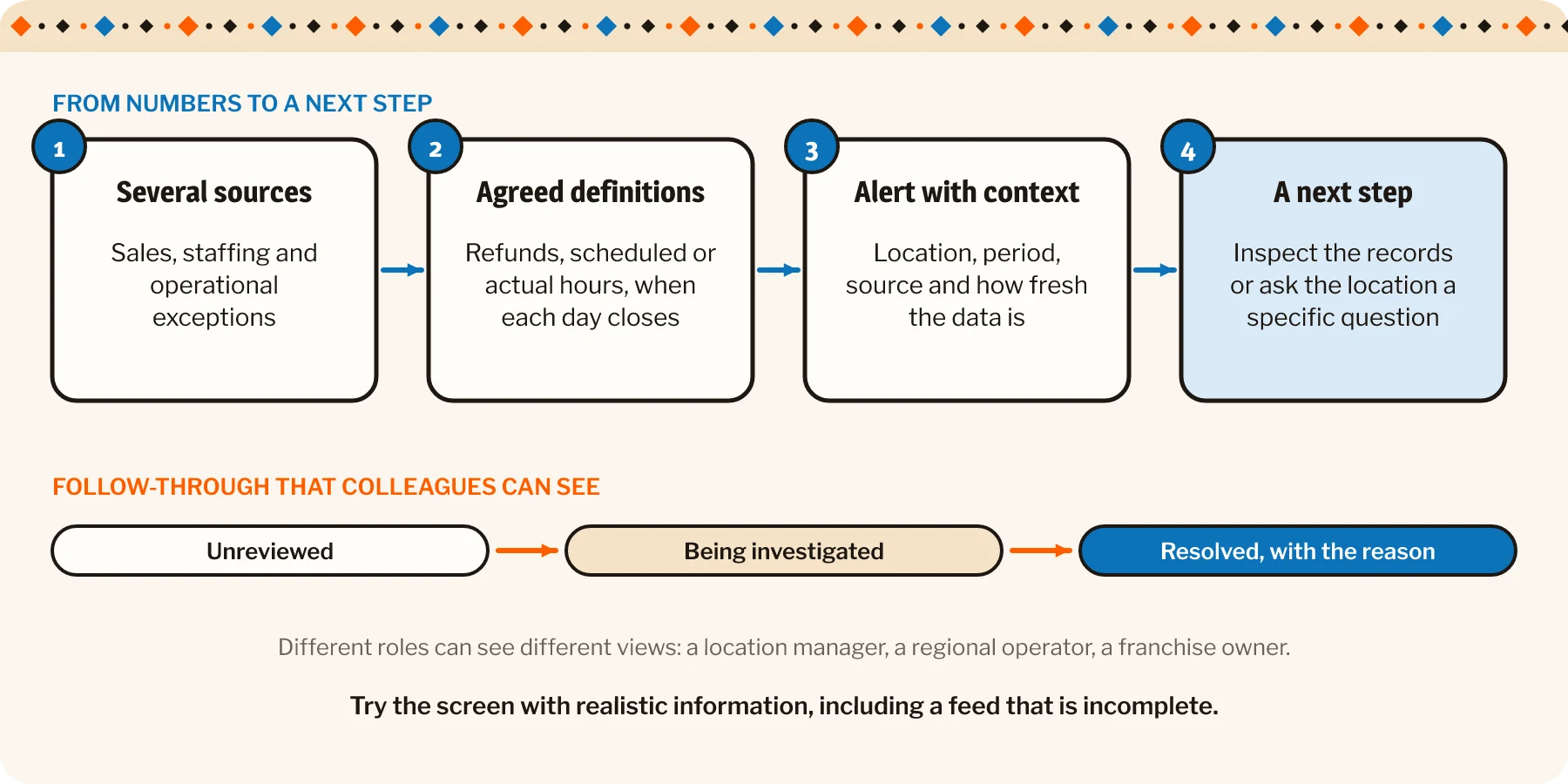
A useful view might bring together sales, staffing and operational exceptions. Before combining them, the team needs to establish what the measures mean and how current they are.
A sales total can include or exclude refunds. Staffing figures may reflect scheduled hours or actual hours. Different locations may close their reporting day at different times. A comparison is more useful once those definitions agree.
Otherwise, the dashboard can deliver an impressively confident argument between incompatible numbers.
We design and build custom web portals and dashboards for exactly this kind of work.
Show the context behind an alert
Suppose one location appears to have an unusual labor-to-sales ratio. The manager needs enough context to understand whether that reflects a reporting delay, a planned training shift or a genuine issue worth investigating.
An alert should identify the period, relevant source and data freshness. Where information is incomplete, say so.
The person receiving it also needs a next step. A flagged number becomes more useful when they can inspect the contributing records or contact the appropriate location with a specific question.
I would design around a few practical needs:
- See which location and period require attention.
- Understand how the measure was calculated.
- Check whether the underlying feeds are current.
- Inspect the records that explain the exception.
- Record who is following up and what happened.
Those needs can guide a small first release. They are easier to evaluate than a broad promise of “better visibility.”
Keep people connected to the result
A manager may investigate an exception and discover that it has a straightforward explanation. That resolution should be visible to colleagues who would otherwise repeat the work.
The system can distinguish an unreviewed alert from one being investigated and one resolved. The wording should match the operation’s actual process.
Related read: The restaurant knows what you ordered. Does it know why you came back?
Access should also reflect the organization. A location manager, regional operator and franchise owner may need different views and actions. Combining information does not require giving everyone identical access.
For a first review, sit with the intended users and walk through a representative shift. Ask which questions they need answered, which existing records they trust and what they currently do when something looks wrong.
Then try the proposed screen with realistic information, including an incomplete feed. If the manager can identify the issue and take a sensible next step, the design is beginning to earn its space.
The IFA’s February outlook anticipates further franchise growth in 2026.2 For an expanding operator, that makes repeatable operating processes worth considering alongside the next location.
A useful platform should carry the definitions and follow-through with it as the business grows. The screen can be attractive, of course. Restaurant people already appreciate good presentation. They also know that, eventually, somebody has to bring the order to the table.