
A mobile menu item says “Services.” There is a small arrow beside it.
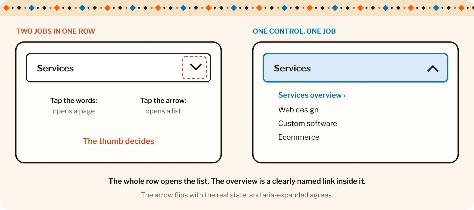
What happens when you tap the words? What happens when you tap the arrow?
If one takes you to a page and the other opens a list, the design has assigned two different jobs to what may look like one control. On a phone, that can make a simple choice depend on exactly where a thumb lands.
An accordion or expandable menu should make its action and state understandable. The icon contributes to that explanation, but the label, hit area and underlying behavior need to agree with it.
Consider a hypothetical service website reviewing that mobile menu.
Follow the action the row appears to offer
In the proposed layout, “Services” introduces several categories. Most visitors need to inspect those choices before deciding where to go.
A single expansion control across the labeled row can provide a clear action. The icon then indicates that more content is available, and its appearance changes when the section opens.
If the site also has a Services overview page, a clearly named link inside the expanded section can provide that route. People can distinguish “show the choices” from “visit the overview” without aiming at opposite corners of the same label.
Vitaly Friedman’s recent accordion-icon discussion makes this consistency particularly useful to examine.1 I would treat the icon choice as part of that wider interaction decision, rather than expect one preferred triangle to repair an ambiguous control.
Make the visible state match the actual state
The icon should change consistently when the panel opens and closes. The associated control also needs the appropriate programmatic state, such as aria-expanded, so assistive technology can identify whether the content is available.
The label should remain clear in both states. Avoid adding several competing symbols that suggest different directions or actions.
A decorative flourish can belong to the brand. The person still needs to recognize whether the menu is open. Small triangles have enough responsibility here without also having to express the entire company philosophy.
Planning a new site? See how we approach custom website creation.
Give the control a comfortable target
A tiny visible icon does not require a tiny clickable area. The labeled control can provide a larger target, with suitable spacing from neighboring actions.
Check the real behavior at common phone widths, with enlarged text and with longer labels. A row that wraps to two lines should still act coherently.
A menu should not require the precision of a jewel heist. The visitor is trying to find a service, usually without a specialist equipment budget.
If this was useful, try An icon should not need its own onboarding process.
Test the expanded content as part of the page
For an accordion pattern, use the appropriate heading and button structure. The WAI-ARIA Authoring Practices guidance describes keyboard operation with Enter or Space, normal Tab navigation and the relationship between the header control and its panel.
Focus should remain visible as the person moves through the controls and available links. Collapsed content should not leave hidden interactive elements in the active navigation sequence.
Then check what happens after a selection. Does the link take the visitor to the expected destination? If they return, can they understand the menu’s state? Does an expanded section unexpectedly cover another important control?
| What good looks like | |
|---|---|
| State | The icon changes when the panel opens, and aria-expanded agrees |
| Target | The whole labelled row is the control, with room from its neighbours |
| Keyboard | Enter or Space toggles, Tab moves on and focus stays visible |
| Hidden content | Collapsed links are out of the tab order |
| After a selection | The link goes where expected and the menu state makes sense on return |
For a practical review, ask someone to find a specific service and watch where they tap. Before they activate the row, ask what they expect it to do. The answer can reveal a mismatch that a visual review misses.
An accordion can be a useful way to organize a smaller screen. It works best when the person can predict the next action and recognize the result.
The arrow can remain tiny in the design. The decision it communicates should be comfortably clear.