
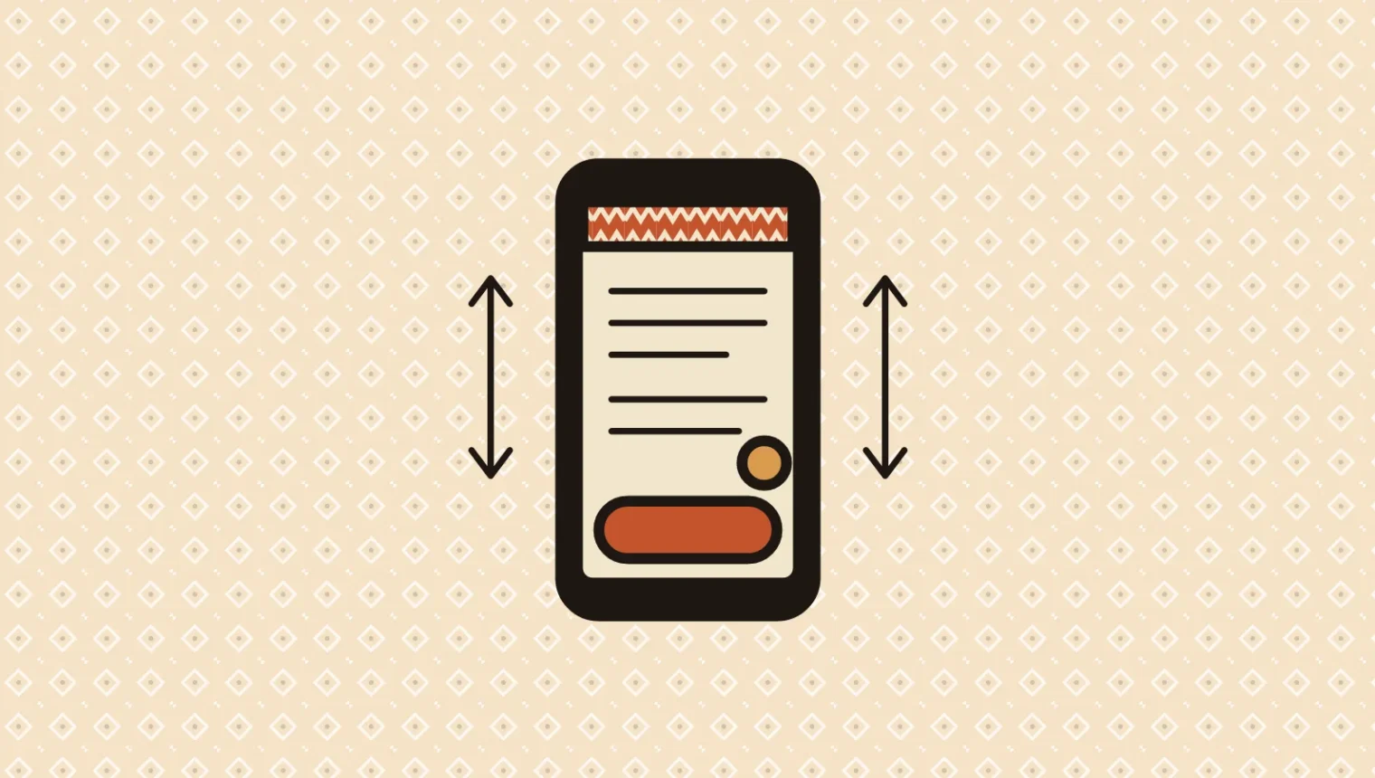
Picture a perfectly respectable service website on a phone. It has a sticky header, a fixed “Book a call” bar, a cookie notice and a chat bubble.
Somewhere underneath, it also has a website.
Each persistent element has a reasonable individual purpose. Together, they can leave the visitor reading through a letterbox. A sticky call to action earns its space when it makes a useful next step available without getting in the way of the decision.
Here is how I would review a hypothetical mobile service page. This is an illustrative audit, rather than a report on a client site.
Follow the visitor down the page
At the top, the main call to action is already visible in the hero. Adding the same fixed button immediately may provide little benefit. I would consider introducing the persistent version after the original leaves view, then checking whether that transition feels calm.
Further down, the visitor is reading the service details. The button should remain understandable, but it does not need a surrounding sales presentation. A short label such as “Book a free call” tells people what happens. A large slogan above it starts negotiating for more screen space.
Then the visitor reaches a comparison section. Does the fixed bar cover the final row? Can they scroll the last item fully into view? Bottom spacing needs to account for the actual bar height, including when its text wraps. A tidy screenshot at one width will not establish that.
The site also needs a plan for the combined overlays. A chat control should not sit on top of the CTA, and a cookie notice should not trap the page between two immovable panels. This is a small coordination problem with very visible consequences.
For a funnel, SEO and CRM integrations working together, read the ShipYourCarNow case study.
Open the form and watch the keyboard
The visitor presses the button and starts entering their details. On a phone, the keyboard reduces the usable view again.
Check whether the active field, its label, any error message and the next relevant control remain accessible. A sticky sales prompt may be unnecessary once the visitor is already completing the action. The page should support that task rather than continue auditioning for it.
Try a real device as well as the browser’s responsive preview. Keyboard and viewport behavior can expose problems that a narrow desktop window does not show.
Related read: Does this really need a popup?
Follow the page with a keyboard, too
Tab through the links and form controls. You should be able to see where focus goes, including when a persistent header or footer overlaps the content.
WCAG 2.2’s Focus Not Obscured (Minimum) criterion requires that an item receiving keyboard focus is not entirely hidden by author-created content. I would aim for a comfortably visible control and focus indicator, rather than treating a tiny exposed corner as a satisfying design result.
Zoom and text resizing deserve the same practical attention. A bar that becomes twice as tall needs room to adapt without concealing the task.
Keep the useful part, trim the entourage
For this hypothetical page, my review notes would be:
- Show the persistent CTA where it adds convenient access.
- Keep its wording and surrounding space compact.
- Coordinate it with chat, consent messages and the mobile menu.
- Adjust its behavior when a form or keyboard is active.
- Check the final content, keyboard focus and enlarged text on real pages.
A small usability check can then compare the revised page with the original. Watch whether people understand the offer, find the action and complete it without battling the interface. Button clicks alone cannot tell you whether the page helped them make a good decision.
I like a useful sticky CTA. It is the digital equivalent of someone being nearby when you need a hand. The moment it starts standing in front of everything you came to see, we should probably ask it to shuffle over.