
A player dashboard can contain plenty of information and still leave someone wondering what to do next.
Their profile is there. So are results, rankings and several equally enthusiastic buttons. The screen has brought all its possessions to the meeting.
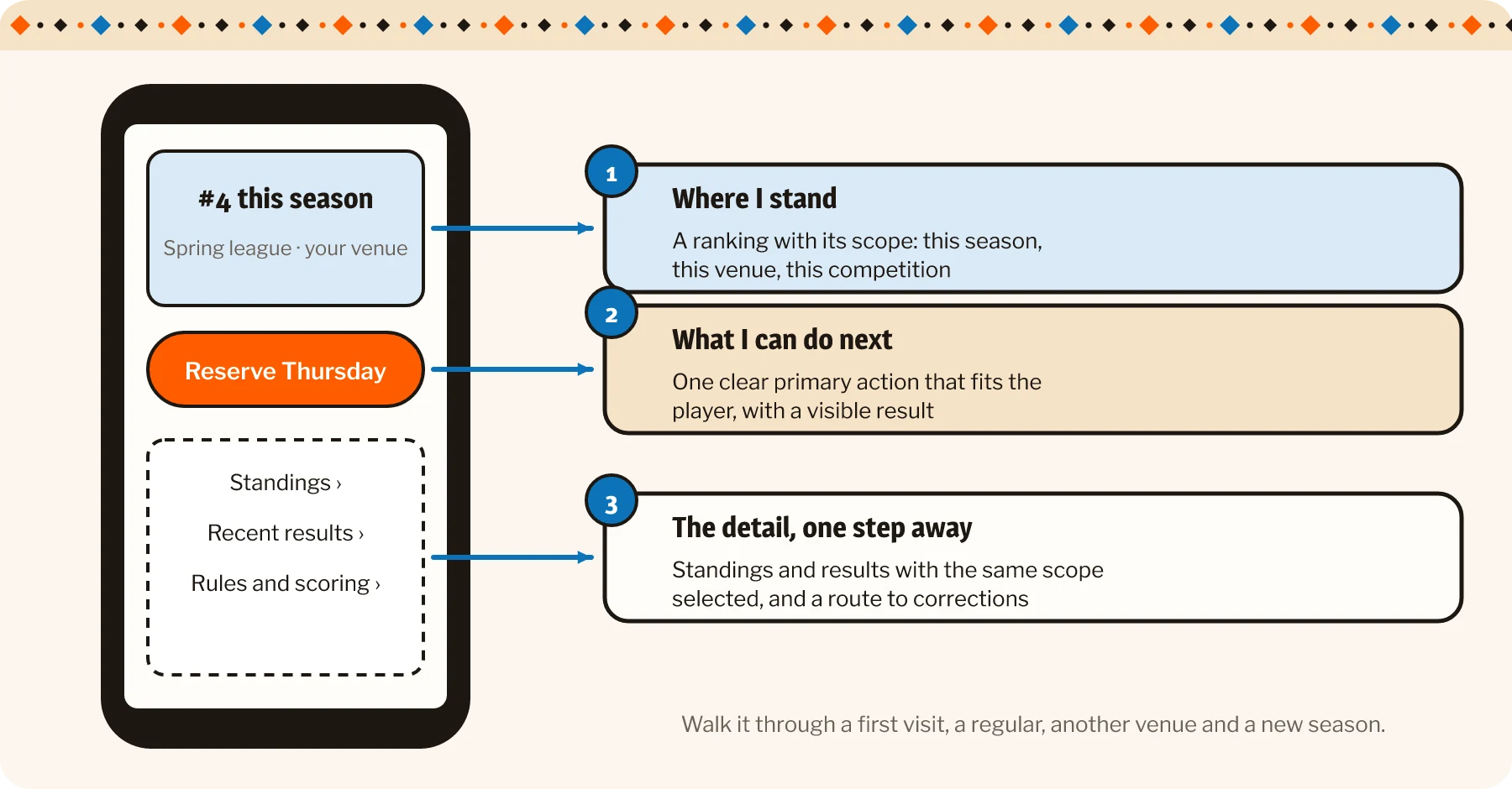
A useful dashboard gives the important information a clear order: where the player stands, what they can do next and where to find the supporting detail.
Our work with Rock ‘n Roll Poker League provides the context for thinking through that experience. The walkthrough below describes design choices around the platform’s player, event and results foundation. It is not a claim that every suggested screen treatment has shipped.
Give the opening view a clear purpose
Begin with the questions a player brings to the page. A newcomer and a regular may need different emphasis, even when they use the same underlying features.
Put current status in a recognizable context
A ranking needs a scope. Show the relevant season, venue or competition beside it so the player can understand what the number refers to.
A position without that context can be misleading. Someone may compare it with a different leaderboard or assume an old result describes the current season.
Use plain labels and make the important distinctions visible. Recorded participation, a pending result and a confirmed standing are different kinds of information. Where the workflow contains those states, the interface should explain them.
A new player also needs a considered starting view. No recorded games is not an error and does not have to look like an abandoned account. Explain how the relevant activity will appear once they participate.
Make the next action fit the player’s situation
For someone looking to play, an appropriate event route may be more useful than a large collection of statistics. For someone returning after a game, the relevant result may deserve more attention.
Choose a clear primary action for the situation and keep supporting actions accessible without making them all compete.
Rock ’n Roll Poker League is one of our favourite gamified builds. See how the Octalysis framework shaped its custom .NET platform.
The action also needs a clear result. If the player reserves a place through the event workflow, show whether that request succeeded and where they can inspect it. If an event is unavailable, give an understandable alternative rather than a button that changes nothing.
That small feedback helps people trust the interface. They should not have to tap repeatedly and hope the league interprets enthusiasm as a reservation strategy.
Let people explore without making exploration compulsory
The overview should carry enough information to orient the player. Detailed records can sit one step deeper, provided the route is obvious.
Connect the summary to its explanation
A standings summary should lead to the relevant view, with the same season and scope already selected. An event reference should lead to that event rather than a generic list that requires another search.
This is where progressive disclosure helps: show the useful summary, then make the explanation available when someone wants it.
Do not hide essential rules behind an obscure icon. A player deciding whether to enter an event needs the relevant conditions before committing. Additional detail should be optional; necessary information should remain findable.
For results, the detail might identify the recorded event and date. A correction route can explain whom to contact when something appears wrong, without turning the player page into the administration interface.
Related read: A new player needs a reason to look at the leaderboard again.
Design the smaller screen as a working view
On a phone, prioritize the status and action before arranging secondary statistics. A wide table may need an appropriate scroll treatment, a compact view or a separate detail screen.
Keep labels understandable when space becomes tight. An unexplained abbreviation can save pixels while spending the player’s patience.
Also check the page with a long name, an empty history and several events. The layout should remain comfortable with the actual variety of league participation.
A live or recently updated display needs an honest indication of freshness where that affects interpretation. If the page cannot refresh, it should not continue presenting old information as confidently current.
Before settling the design, I would walk through four situations: a first visit, a returning regular, someone checking another venue and the start of a new season. Ask what each person understands and what they would do next.
That review can reveal whether the hierarchy supports the journey or merely looks tidy in the design file.
A good player dashboard feels personal without becoming complicated. It gives someone a place in the league and a comfortable route back into the activity. The poker can supply the interesting decisions. Finding the next game should be one of the easier ones.