
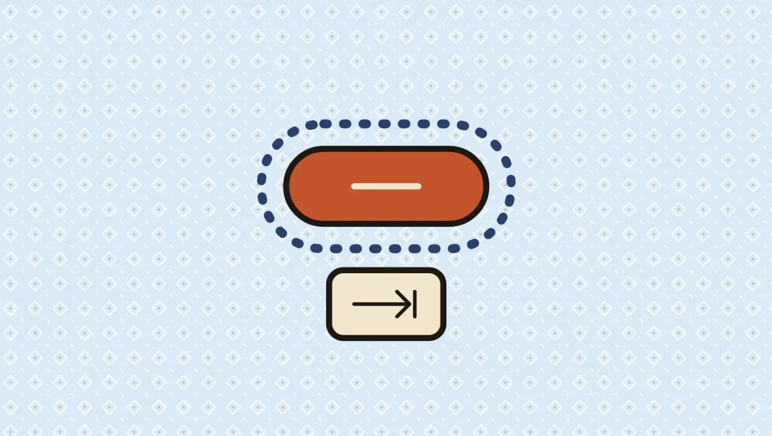
A button can look immaculate in a design review and become surprisingly mysterious the moment somebody puts the mouse down.
Press Tab. Where did the focus go? If the answer requires a small search party, the component isn’t finished.
Keyboard focus identifies the control that will receive the next action. Its visible indicator belongs in the design alongside hover, selection and error states. WCAG 2.2 becoming a W3C Recommendation on October 5, 2023 gives teams another reason to review those details, including obscured focus and target size.1
This isn’t about adding an apologetic blue rectangle after the beautiful work is done. The rectangle is doing a job. We can design it properly.
Design the state people actually use
A focus indicator needs to remain visible across the contexts in which the component appears. One attractive outline color won’t necessarily survive a white page, a dark panel and a busy photograph.
Focus and selection tell different stories
A selected tab tells you which content panel is open. A focused tab tells you where the next keyboard action will land. Those states may coincide, but they are not interchangeable.
If you move focus without changing selection, the interface should still make the location clear. Otherwise, somebody navigating by keyboard can lose their place while the page continues looking entirely content with itself.
Include both states in the component examples. Test them together and independently. This also helps avoid a design handoff in which the developer has to invent the missing interaction state at the eleventh hour.
An outline can be deliberate
Sara Soueidan’s guidance explains useful properties of outlines, including that they need not change the surrounding layout.2 A border that appears only on focus can shift neighboring content unless space was reserved for it.
The choice isn’t limited to the browser default or no indicator at all. A custom treatment can fit the brand while providing clear contrast and enough visible area.
Review the actual combinations, rather than approving a single sample button. If the component can sit over photography, test light and dark parts of the image. A ring that disappears over half the possible backgrounds has a rather flexible definition of visible.
Planning a new site? See how we approach custom website creation.
Check what sits above the focused control
WCAG 2.2 includes Focus Not Obscured at Level AA. Its minimum requirement addresses a component with keyboard focus being entirely hidden by author-created content.
That makes sticky headers, persistent buttons and overlays part of the review. They don’t get an exemption for being useful in their own meetings.
A header can hide a successful navigation
On a hypothetical service website, a visitor tabs to a link near the top of the viewport. The browser moves focus correctly, but the sticky header covers the link.
From the code’s point of view, the move happened. From the visitor’s point of view, the location vanished. Resolve the overlap and test the journey again, including at increased zoom.
A cookie notice or chat launcher can create similar problems elsewhere. Review the combination of persistent elements. Individually modest controls can collectively occupy an ambitious amount of a phone screen.
Focus Appearance is a separate Level AAA criterion. Keep those conformance levels distinct when discussing requirements. You can aim for stronger usability without describing every improvement as the same technical obligation.
Worth reading next: An icon should not need its own onboarding process.
Make the target usable, then try the journey
Pointer target size is a related but separate concern. WCAG 2.2’s Target Size (Minimum) generally specifies at least 24 by 24 CSS pixels, with stated exceptions including sufficient spacing and inline links.
That is a minimum rule with conditions. It isn’t an instruction to make an important button exactly that small and consider the matter settled.
A restrained icon can sit inside a larger clickable area. The visual design stays compact while the interaction gives people room to act. Check that adjacent targets do not turn a tap into an accidental choice.
Zulu Shack recommends testing a complete task before approving a reusable navigation or form component. Open the mobile menu, reach a service page and complete an inquiry using the keyboard. Check the order, visibility, activation behavior and where focus returns after an overlay closes.
Repeat at a narrow viewport and increased zoom. A visible focus ring doesn’t establish that the rest of the interaction works, but it makes failures much easier to find.
For a custom WordPress theme, capture these behaviors in the component definition so they travel with it across the site. Otherwise, every page becomes another opportunity to forget the same detail.
There is plenty of room for a website to have personality. Its controls should still be clear about which one is currently listening. That little outline is carrying more of the conversation than its size suggests.