
The screenshot looks composed. The page loading into that screenshot is having a slightly busier experience.
The heading arrives, the image expands, the menu moves and a late notice pushes everything down again. The final layout is attractive; getting there feels like watching someone rearrange the room while you are trying to sit down.
Visual stability deserves its own review in a custom WordPress theme. Cumulative Layout Shift, or CLS, measures unexpected layout movement as people experience the page. Improving it begins with identifying what changes size or position and why.
Reserve the space before the image arrives
A useful starting point is the hero image. The browser should know the space it occupies before the file finishes loading.
For an ordinary image element, appropriate width and height information can establish its aspect ratio. The CSS then needs to preserve the intended relationship as the layout adapts. A responsive design may use an explicit aspect ratio or another suitable size strategy for its image container.
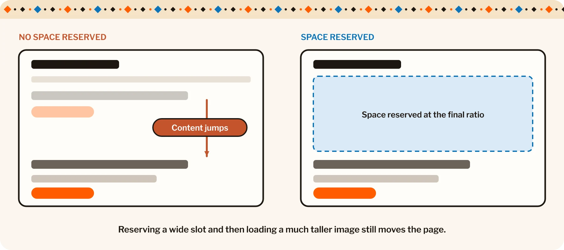
The important point is agreement between the reserved space and the eventual content. Reserving a wide image slot and later replacing it with a much taller shape still moves the page.
WordPress’s responsive-image support helps with delivering suitable resources. A smaller file and a stable layout remain separate concerns. A page builder, custom component or background-image implementation needs its own appropriate sizing rules.
Image-led sites live or die on how the photography is handled. See the digital showroom we built for Cavastone.
Follow the movement to its cause
A performance report may identify the heading that moved. The cause can be an image, banner or other element inserted above it.
Record the page loading and inspect the layout-shift information in the browser’s performance tools. Chrome’s guidance makes this distinction useful: the affected element is a clue, while the source of the movement may be elsewhere.
Fonts can change the layout too. The fallback and final typefaces may occupy different space, causing headings to wrap differently when the web font arrives. Choose suitable fallbacks and loading arrangements, and inspect the actual change rather than assuming that one font-display setting solves everything.
Late content needs deliberate space or placement. A notice, embedded form or third-party widget can disrupt a page that was stable before it arrived. Think through how that content enters the layout and whether its dimensions are predictable.
If this was useful, try The mobile hero deserves its own crop.
For a practical review, I would check:
- Image dimensions and the space reserved at each relevant layout size.
- Font changes in headings, navigation and prominent buttons.
- Banners, embeds and other content added after the initial render.
- Mobile layouts and slower loading conditions.
- Movement during scrolling and later interaction, as well as initial loading.
Test, change and test again
| Source | What you see | A proportionate fix |
|---|---|---|
| An image without reserved space | The heading below it jumps as the file loads | Width and height, or an aspect ratio that matches the final image |
| A font change | Headings and buttons rewrap when the web font arrives | A closer fallback and a considered loading arrangement |
| A late banner or notice | Everything is pushed down after the page settles | Reserved space or a placement that does not move content |
| An embed or widget | A form or third-party block expands after loading | Predictable dimensions for the container |
Use both controlled testing and available real-user information. A short lab test can miss a shift that occurs later in a visit. Check whether field data describes the individual page or a broader site grouping before drawing conclusions.
Then change the relevant component and repeat the affected journey. Hiding the moving element may improve a score while removing something useful, so verify the complete page experience.
I would keep the solution proportionate. A well-sized image container, a better font fallback or a more considered banner position may address the problem without rebuilding the page around it.
A stable site lets people read, choose and continue without chasing the interface. The polished screenshot can then represent the experience, rather than merely document where everything eventually landed.